
By Catherine Austin Fitts
My “go to” website for technical analysis of precious metals, the US dollar & the US stock market is Rambus Chartology, where Rambus (that’s his handle – he’s the founding technical analyst) leads a discussion with extensive charts of what the markets are saying.
In January 2016, Rambus launched his quarterly Solari Report with a Blockbuster Chartology. You can find links to the entire series of quarterly and annual Blockbuster Chartologies at the end of this latest piece.
One of the reasons that Rambus is so good at his craft is that he focuses on “staying on the right side of the major trend.” The challenge of doing so at this time is that it is tempting to look for bottoms or to assume that the trend upwards in the US dollar or stock market may be over. However, Rambus consistently brings us back to the discipline of the Chartology. What does price tell us? As he describes so aptly, we are dealing with psychological warfare.
Sitting back once each quarter to get this perspective offers invaluable insight. So, here we go for the 2nd Quarter 2023 Wrap Up Blockbuster Chartology!
Blockbuster Chartology Quarterly Report
By Rambus
~ 2nd Quarter 2023 Wrap Up ~
Published on August 1, 2023
Some Firming Areas In the Stock Markets
In Depth Look At Commodities
PM Complex
Some Firming Areas In the Stock Markets
Tonight we’ll look at some areas in the markets that are beginning to show some life after a pretty significant correction in many cases. While the big cap tech stocks have been in the spotlight since October of 2022 there are several other areas that haven’t gotten much attention after their massive 2020 crash low. Commodities in general and the energy complex specifically could be getting ready to move higher.
Lets start with the weekly triple combo chart which has the CRB index on top with the US dollar in the middle and Gold on the bottom we’ve been following very closely. Last week the CRB index closed above the top rail of its 2022 blue falling wedge. Two weeks ago the US dollar broke below the center dashed midline of its 2011 uptrend line with a possible completed backtest last week. GLD on the bottom has found support close to the center dashed midline of its 2020 trading range with the 65 week ema helping with support.
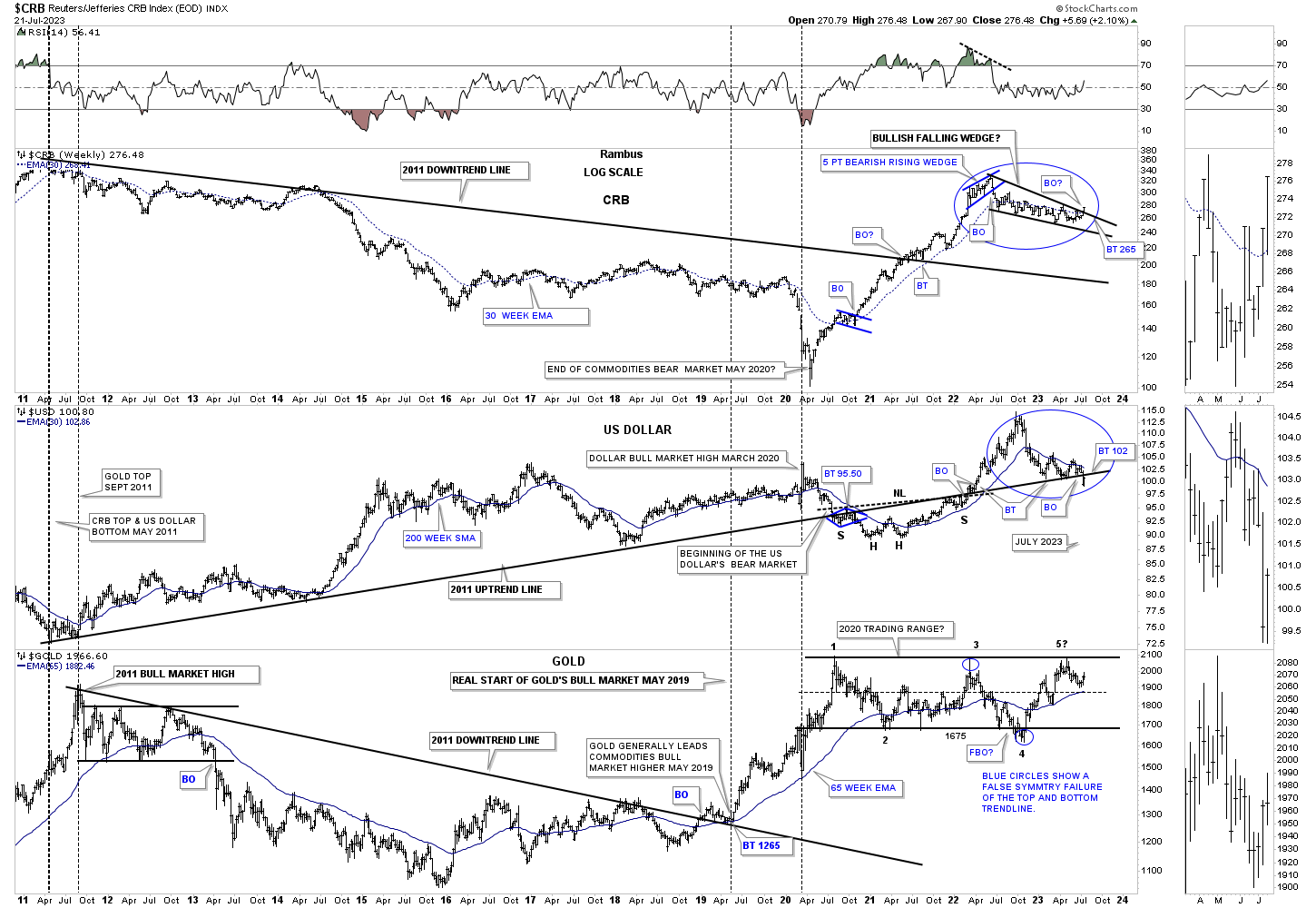
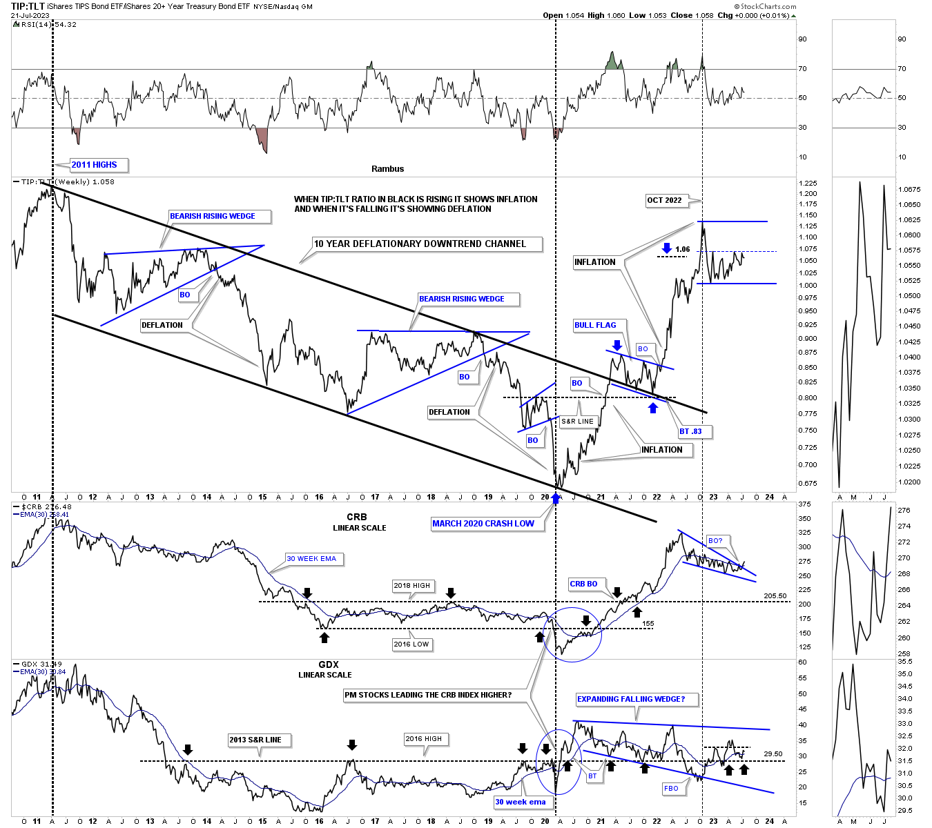
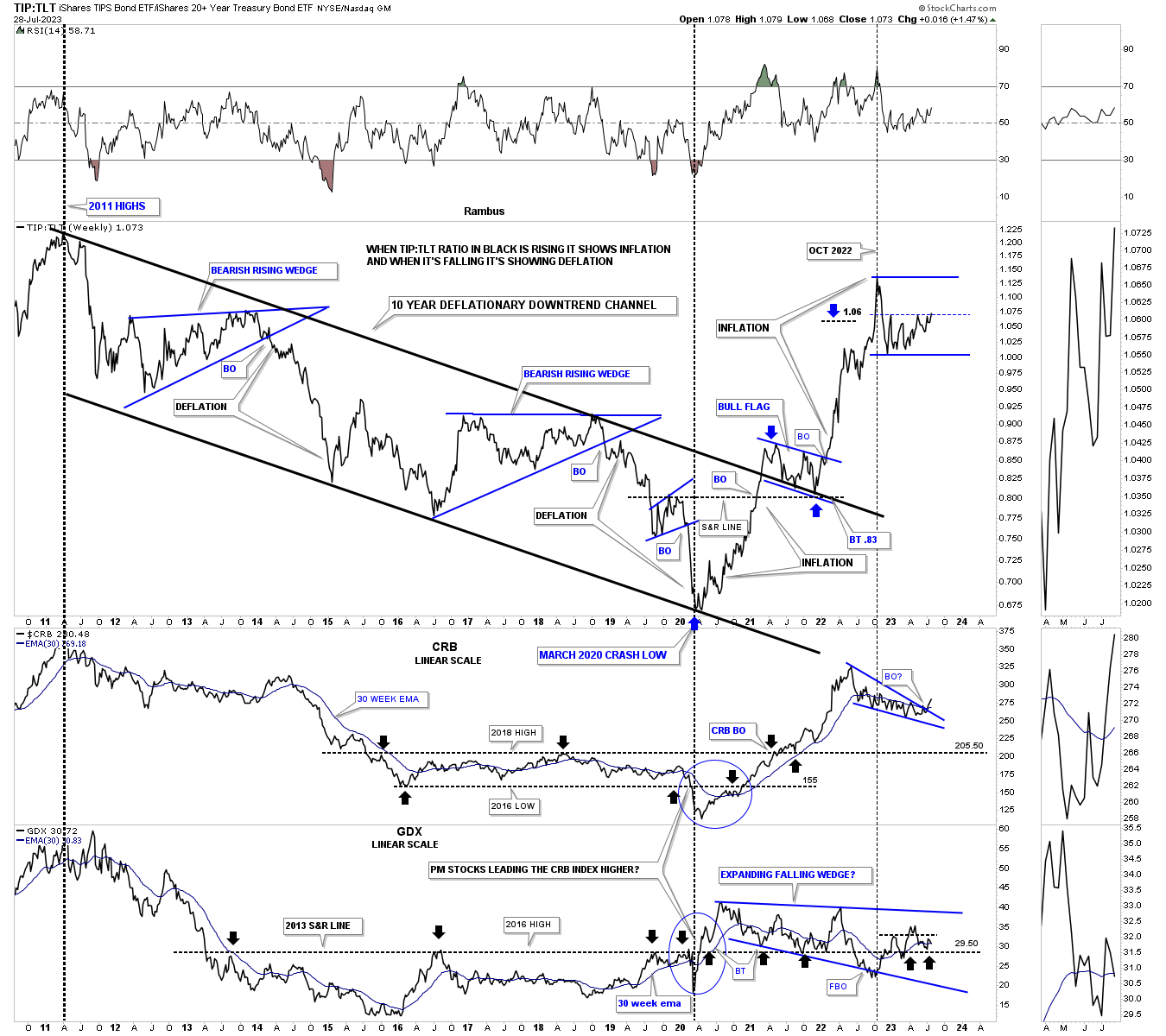
This next weekly combo chart has the TIP:TLT ratio on top showing inflation or deflation with the CRB index in the middle with the GDX on the bottom. When the TIP:TLT ratio is declining, 2011 to the 2020 crash low, that shows a general trend of deflation and when the ratio is rising, 2020 crash low to the present, that shows inflation bias. Since the 2020 low you can see there have been two bouts of inflation separated by the blue bull flag that formed the backtest to the 2011 parallel downtrend channel.
Last week the CRB index may have broken out from its year long falling wedge and closed the week above its 30 week ema. On the bottom is the GDX which shows the blue 2020 trading range along with the 2016 S&R line which comes into play around the 29.50 area as shown by the black arrows. Normally the PM complex will lead the CRB index higher off of an important low like the 2020 crash low. As inflation began to rise out of the 2020 low the GDX led with the CRB index by a month or so. What really stands out is how well the CRB index did vs the GDX out of the 2020 bottom. Maybe it is time for the GDX to lead the CRB index higher for awhile as it has a much bigger consolidation pattern.
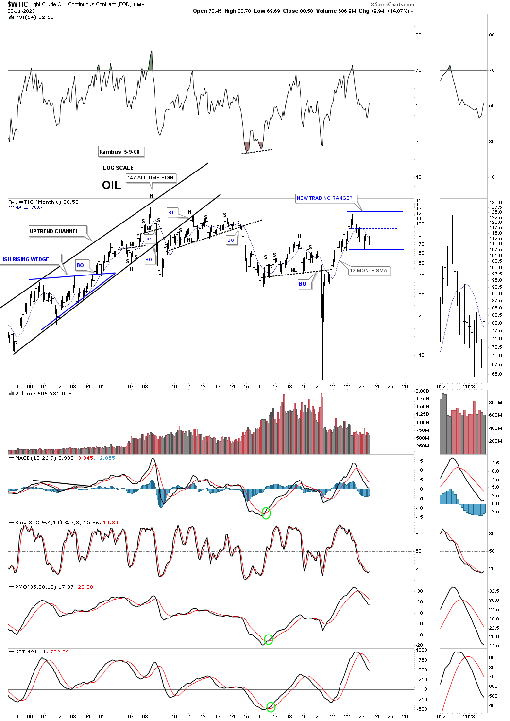
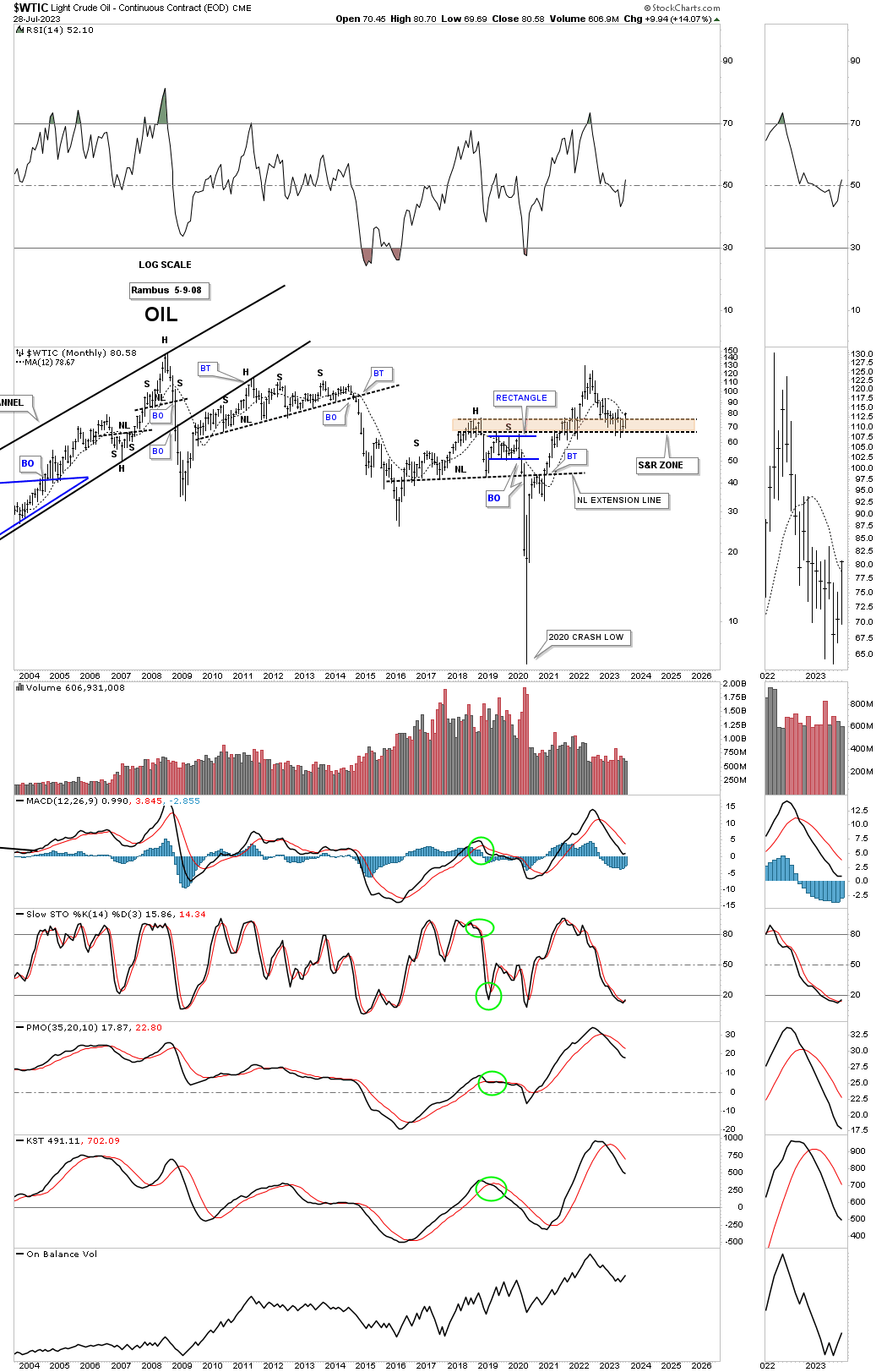
Within the commodities complex the energy sector is starting to look interesting once again with the USO / OIL breaking out of its 2022 falling wedge last week and closed above its 12 month sma with one more week to go.
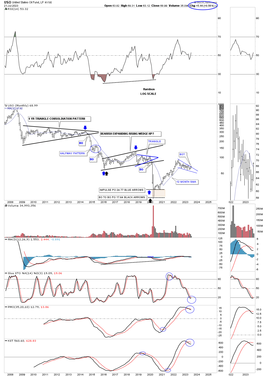
Its been awhile since we last looked at this monthly combo candlestick chart for the energy complex which bottomed in 2020 after breaking down from a multiple year trading range. That nearly two year rally out of the 2020 crash low was very strong and finally burned out which led to the current consolidation phase. As you can see the consolidation patterns within the energy complex has taken on several different patterns. There are several triangles with several bullish rising wedges with the USO showing a falling wedge.
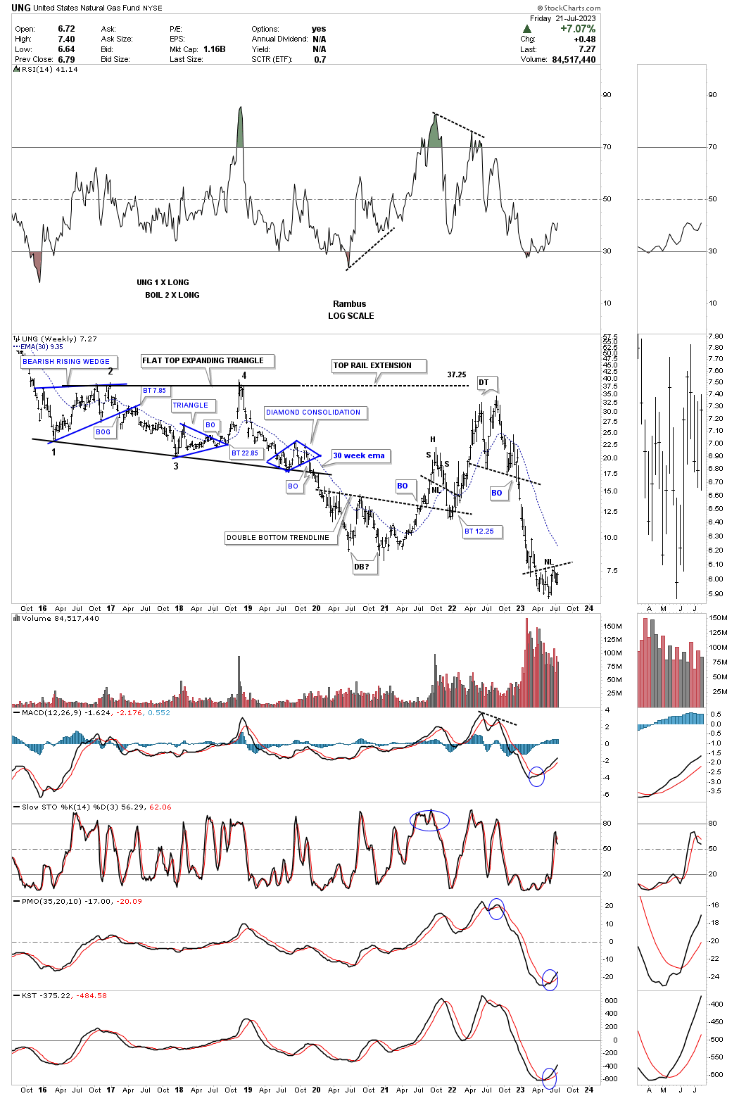
The areas showing the blue rising wedges and triangles are showing relative strength vs the USO. UNG looks particularly interesting as it is forming a possible inverse H&S bottom after a massive decline.
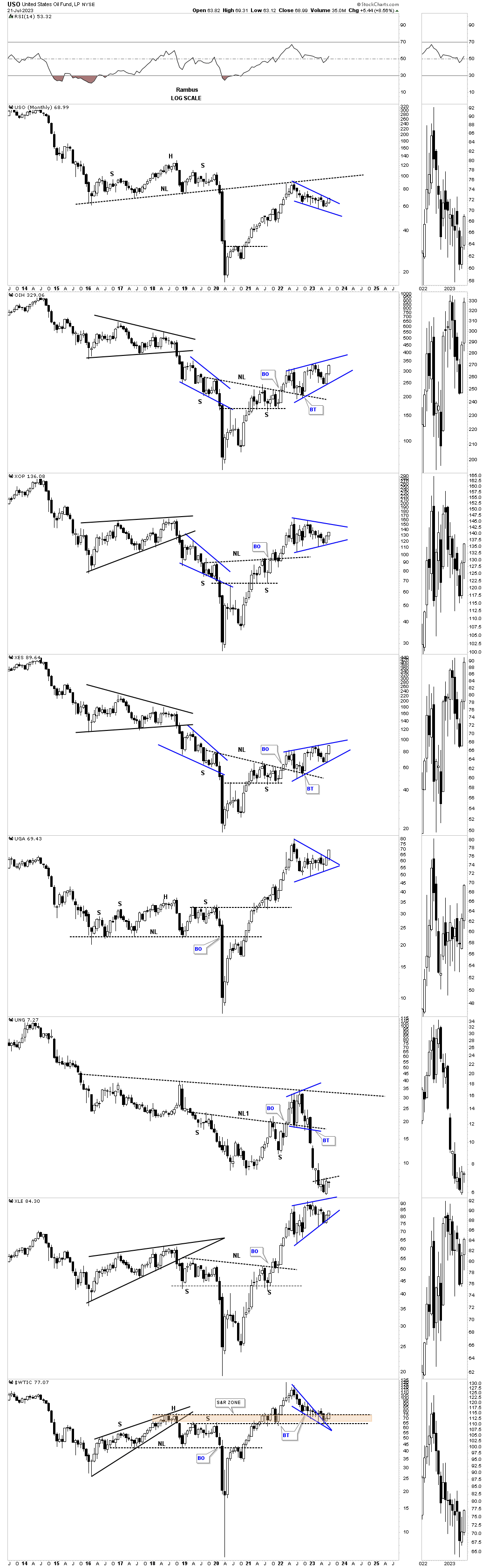
The next area in the energy complex that is starting to look interesting is the XOI, big cap oil stocks index. For over a year now the XOI has been carving out a possible triangle consolidation pattern with the bottom rail being hit on many occasions. Last week a new higher high was made which is the first thing we needed to see to start forming a new uptrend. The price action is also trading comfortably above the 30 week ema.
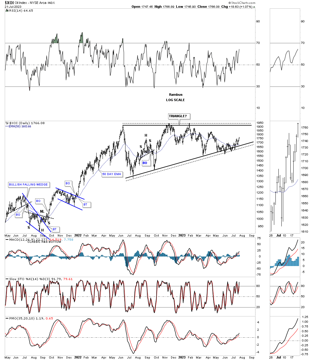
This weekly chart shows the 2020 rally with the current triangle consolidation pattern under construction.
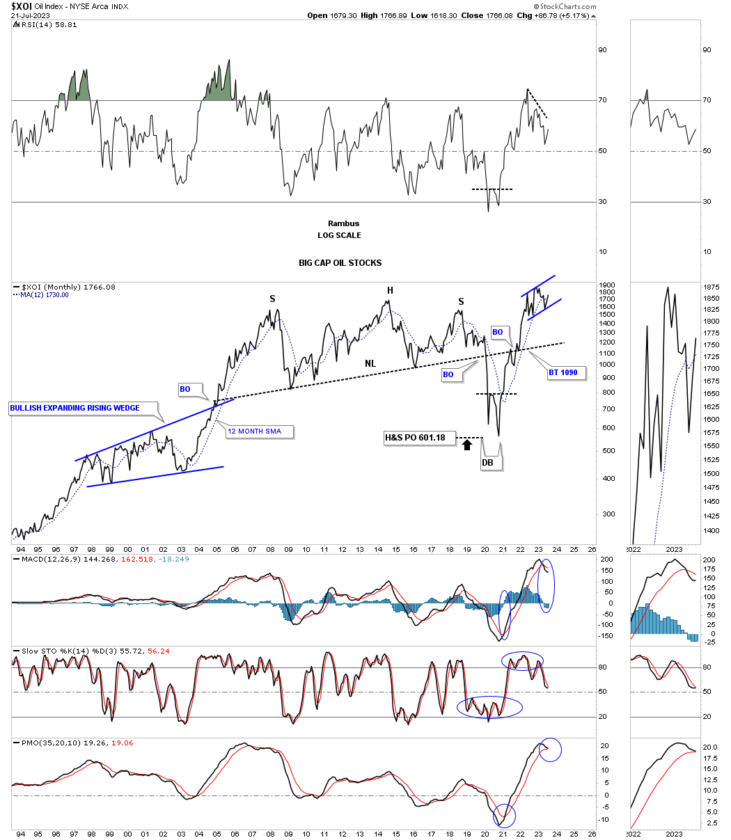
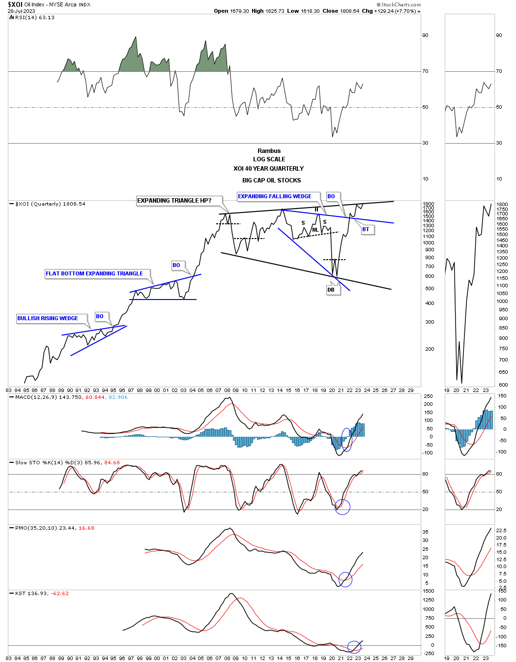
This very long term monthly chart shows the massive H&S top which led to the 2020 crash low with the price objective being reached. The double bottom reversal pattern led to the near vertical rally to new all time highs where the latest trading range is forming.
The last time we looked at this history chart for the XOI it had just broken out from the bullish expanding falling wedge and was in backtest mode. The much bigger black expanding triangle looks similar to Gold’s 2020 trading range. From the quarterly line chart perspective and with a breakout above the blue bullish expanding falling wedge the price action is now trading just below the black trendline in what could be a major impulse move coming up similar to what took place on the left side of the chart.
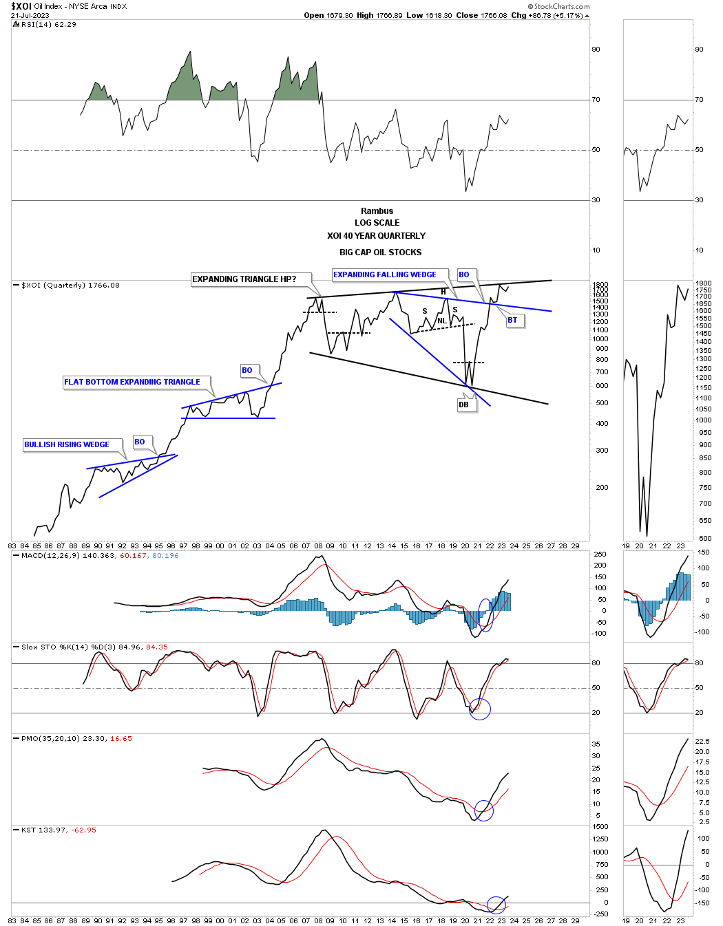
Gold quarterly line chart shows the price action trading just below the 2011 trendline.
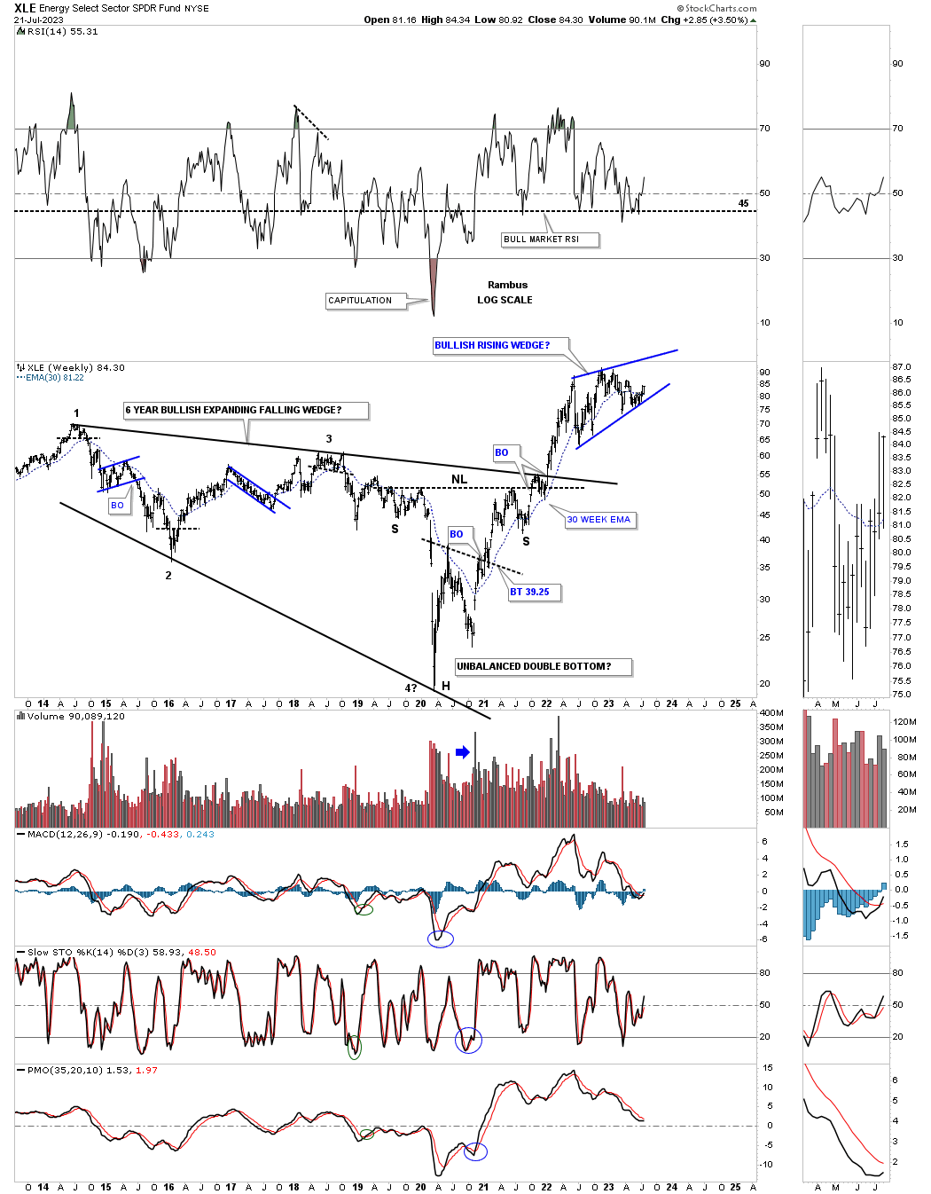
Next is the daily chart for the XLE, energy stocks etf, which has been forming a rising wedge since its 2022 high. As you can see for most of 2023 the price action has been slowly walking up the bottom trendline and closed back above its 200 day sma last week.
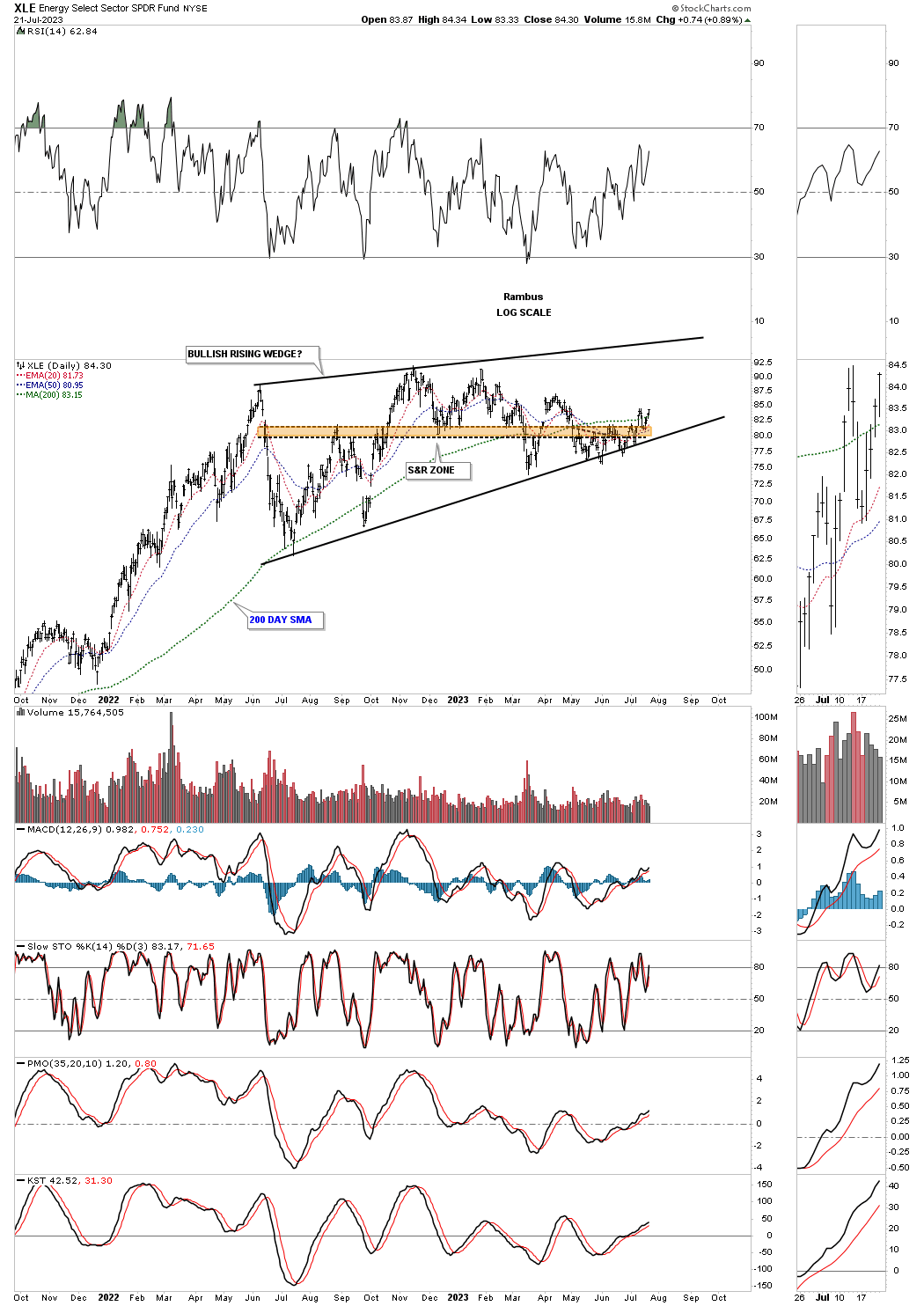
This weekly chart shows how the the blue rising wedge fits into the bigger picture. Note the horizontal line on the RSI at 45. When a stock or index is in a bull market many times the RSI will only get down to the 40 area before the next rally takes place. I don’t show it on this chart but if you took a vertical line to where the RSI hit 40 after the 2020 crash low you will see each low is higher than the previous low. Where the RSI is currently trading suggests there is alot of room for the XLE to move much higher before becoming overbought.
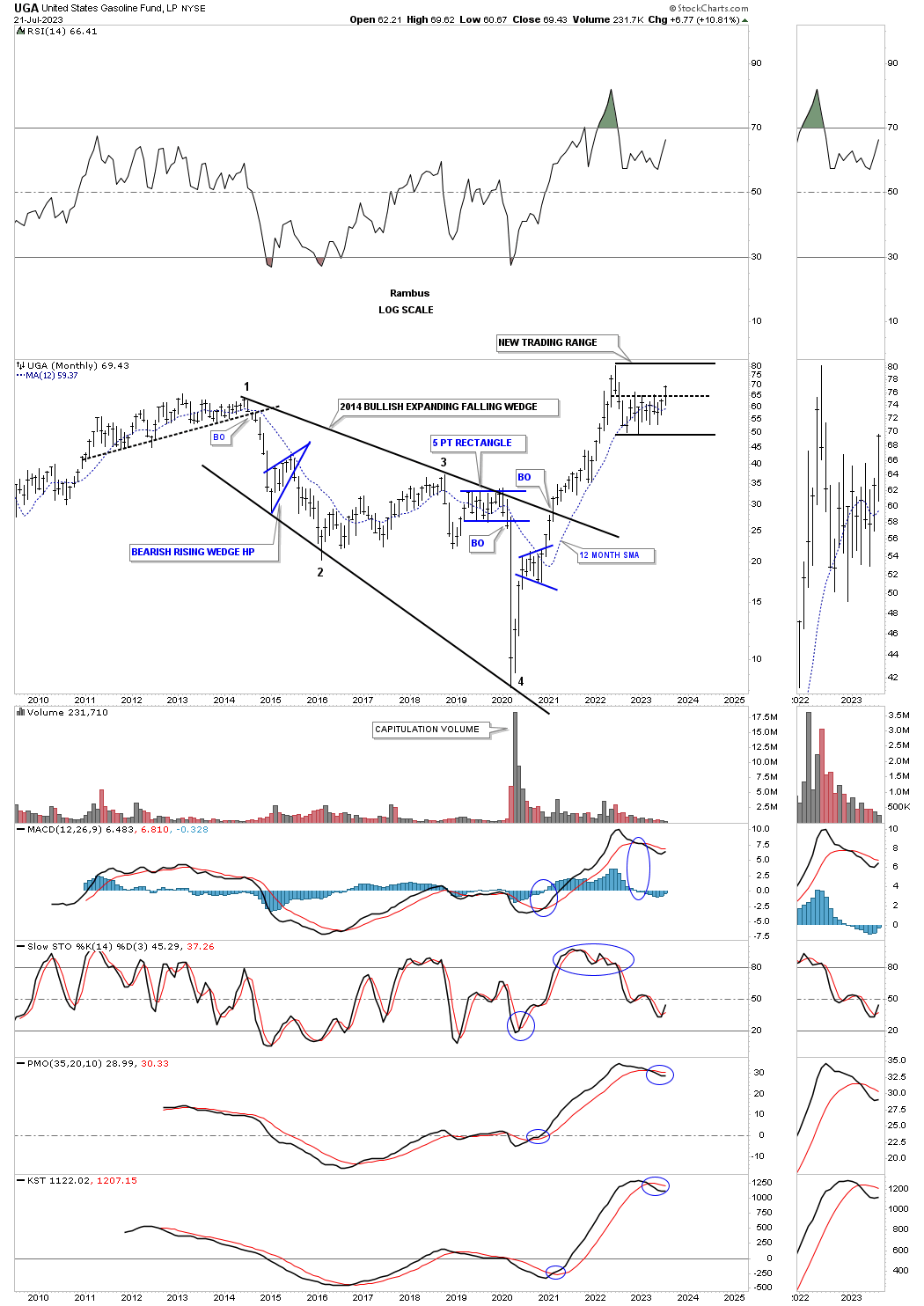
Last week the UGA, gasoline fund, broke above the center dashed midline of its 2022 horizontal trading range making a new higher high.
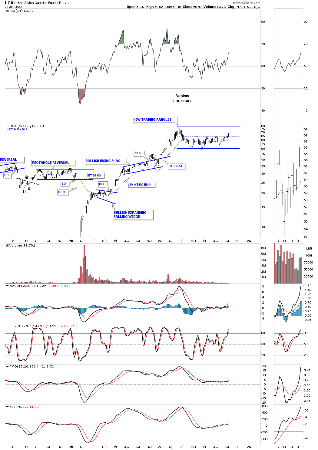
This monthly chart shows the massive rally out of the 2020 low.
Next is the weekly chart for the UNG, natural gas fund, which is showing a possible inverse H&S bottom after making new yearly lows just a couple of months ago. I may take a position in BOIL and have no sell/stop and let the price action do its thing.
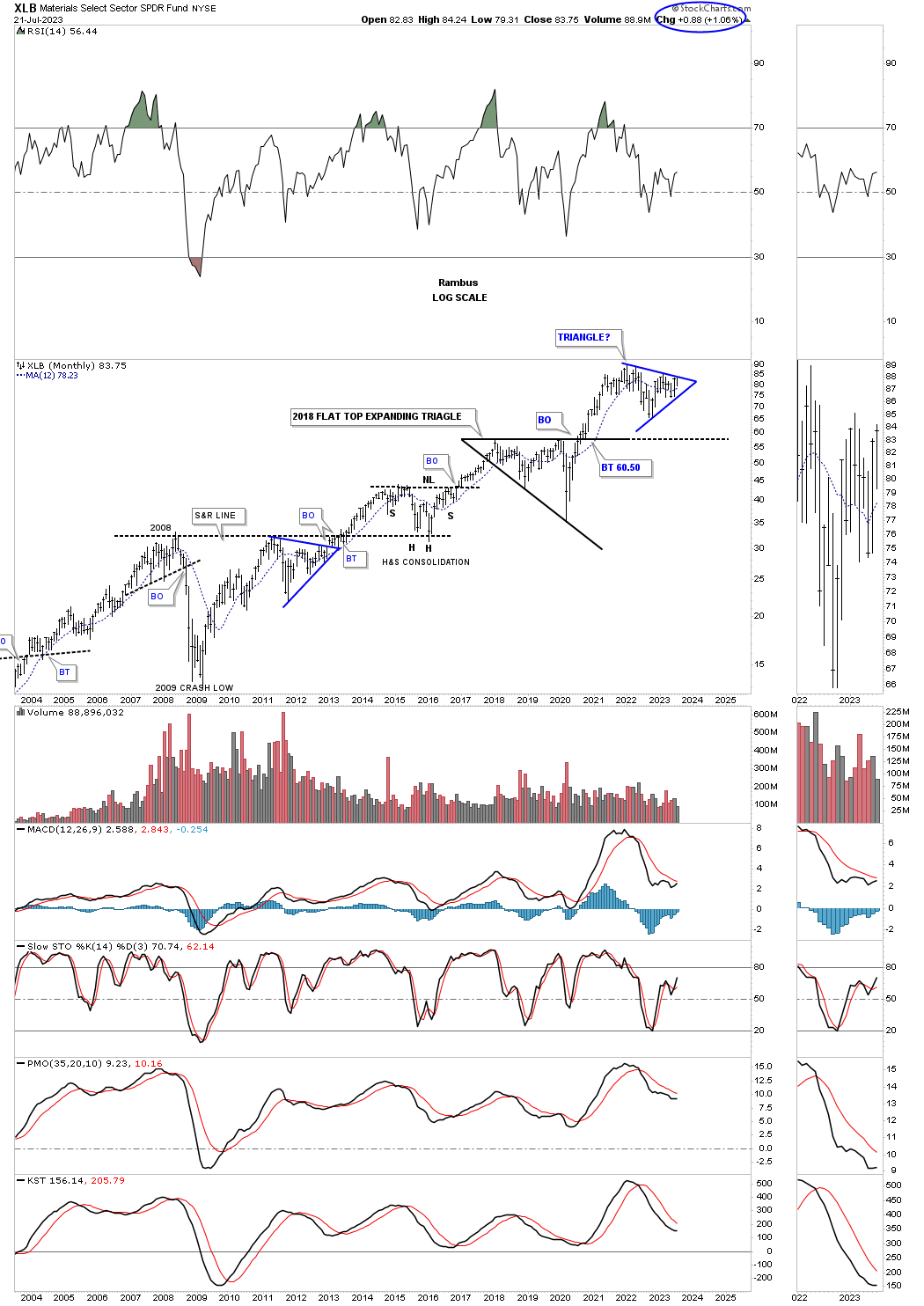
This next area that is starting to show some bullishness is the XLB, basic materials fund, which shows the price action flirting with the neckline of a fairly large H&S consolidation pattern.
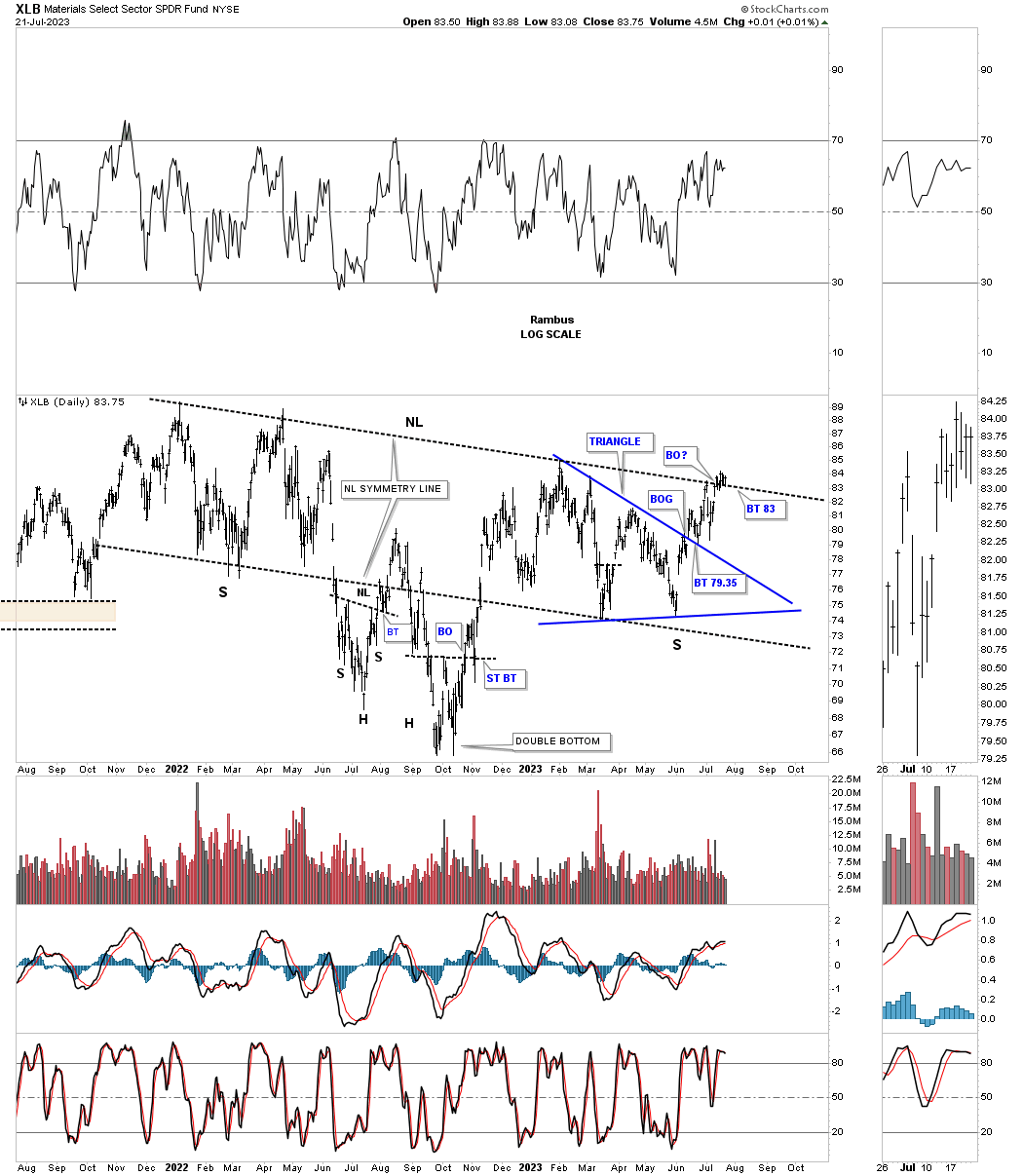
This weekly chart shows the potential triangle consolidation pattern that may be in the process of breaking out. Again, note the massive rally out of the 2020 crash low and the sideways trading range that actually began at the lower high in early 2021.
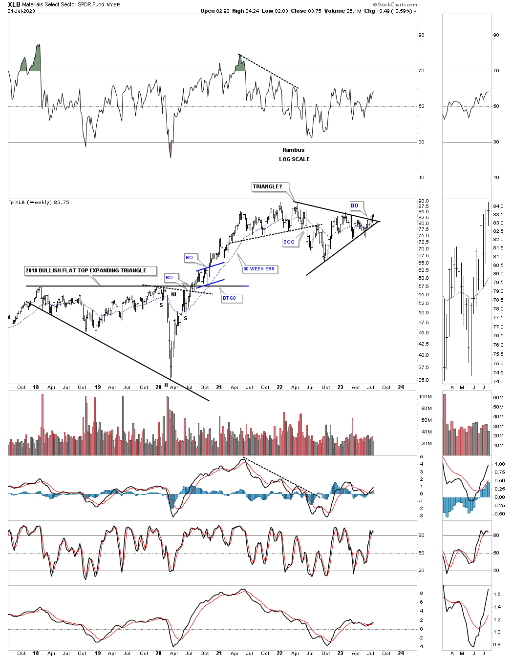
This monthly chart shows the secular bull market that began at the 2009 crash low with the blue triangle forming on top of the black flat top expanding triangle.
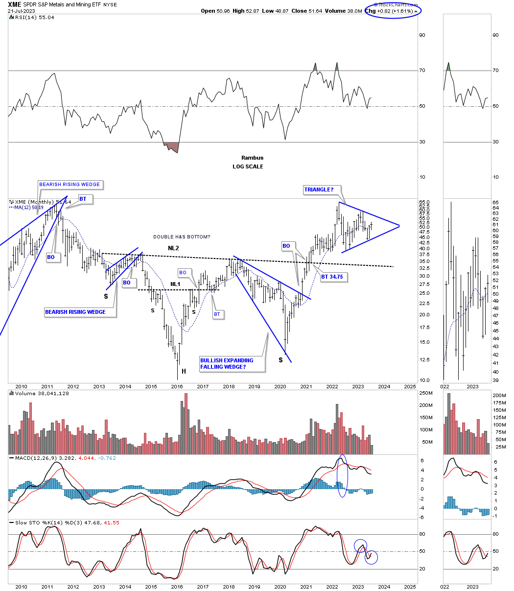
Next is the XME, metals and mining etf, which is forming a similar triangle to the XLB, but is a bit behind in completing its triangle.
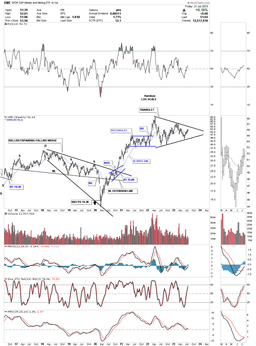
This long term monthly chart shows the blue triangle forming above the neckline of the massive H&S bottom.
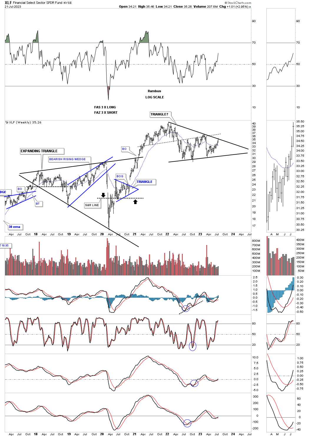
The XLF, financial fund, just completed its 4th reversal point hitting the top rail of its 2022 triangle consolidation pattern. We should expect to see a mild pull back and if the bulls are in charge they should then take the XLF above the top rail.
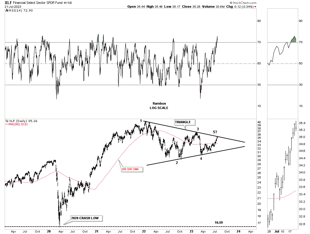
This weekly chart shows the strong impulse move out of its 2020 crash low with the black triangle forming the first consolidation pattern?
Another area that is starting to look very interesting once again is the XLV, health care fund, which could be in the process of breaking out form the multi year Diamond consolidation pattern. Note how the top rail extension line has held support, for the most part, during the Diamond consolidation pattern.
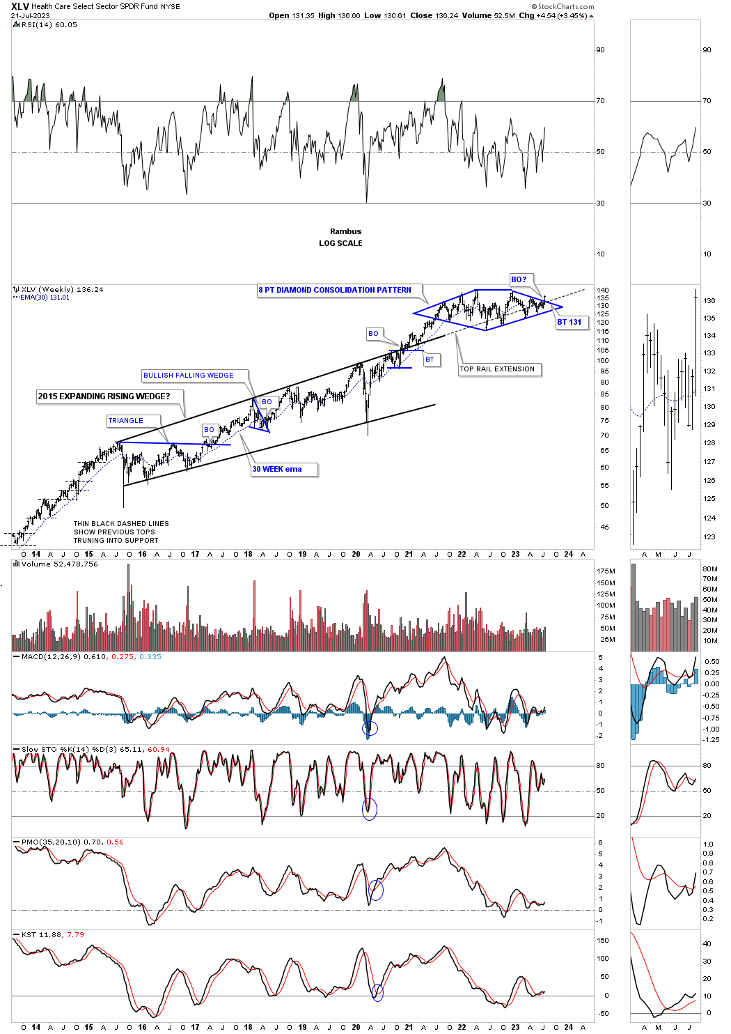
This last chart for tonight shows the secular bull market that began with the large 5 year H&S bottom at the 2009 low. I added the horizontal black dashed line to the RSI 50 which shows support since the 2009 bull market began.
There are other areas that are also starting to look very interesting which are part of the 2009 secular bull market where you see one consolidation pattern forming on top of the previous one. Also, if you go back and look at the different areas within the commodities complex you will see most have formed the bullish expanding falling wedge which is one of the strongest chart patterns, but is the hardest to spot in real time because the last low is so much lower than the previous low which shakes out the rest of the bulls before the turnaround begins.
Keep in mind we are looking at mostly long term charts so what happens tomorrow or next week might not look that significant, but what the big picture is showing us is significant. All the best…Rambus
In Depth Look At Commodities
Its been awhile since I last did an in depth report on commodities which have mostly been in consolidation mode since their massive impulse move out of the 2020 pandemic crash low. Rising commodity prices usually signals inflation is not far behind. Even with all of the FED rate hikes I think they are going to have trouble keeping inflation under control.
Most of the commodity charts to follow show the big picture which is why inflation is going to be sticky moving forward. With the infrastructure build out taking place there will be a lot of demand for many commodities like steel, copper and energy to get the job done which won’t be overnight. Keep in mind, for the most part, commodities have been in a long drawn out bear market which began in 2008 in many cases with the 2020 pandemic low being the bottom of the bear market.
There are many charts tonight so lets get started. Most of the charts are pretty self explanatory so I won’t spend a lot of time dissecting each long term chart.
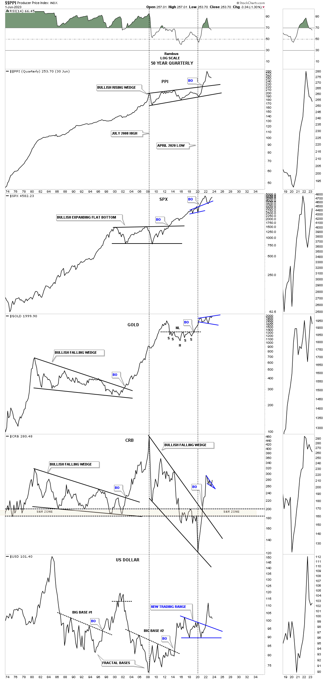
First I would like to start with the 50 year quarterly line combo chart for the PPI with the SPX, Gold, CRB index and the US dollar on the bottom. Looking at the PPI on top you can see inflation over the long term is just a fact of life as it has been steadily rising for the last 50 years.
In 2008 the PPI, Producer Price Index, began to trade sideways which led to the bear market in the CRB index. At the 2020 low is when the bear market ended and the first leg up in the new bull market began for the CRB index. That 12 year bear market formed the bullish rising wedge on the PPI which had a nice strong breakout completing the massive consolidation pattern.
The SPX doesn’t seem too affected by rising inflation as it is trading close to its all time highs. Gold just below the SPX is also trading very close to its all time highs. Note the CRB index which is in the process of breaking out from the small blue bullish falling wedge. On the very bottom is the US dollar which has been declining for most of 2023 which puts a tailwind behind the commodities complex.
This next chart is a ratio combo chart which has the TIP:TLT ratio on top followed by the CRB index with the GDX on the bottom. When the ratio chart on top is falling that shows a general trend of deflation and when it is rising a general trend of inflation. You can see what happened after a nearly 10 year bear market decline in the ratio which bottomed in March of 2020 which has been rising steadily ever since. The CRB index just below the ratio shows it breaking out from the small blue falling wedge while the GDX on the bottom is in its own little world and is still trading sideways since its 2020 high.
Now lets look at some different commodity indexes so you can see the rally out of the 2020 crash low which ended the bear market. This monthly chart shows the bear market which started at the 2008 high and ended at the 2020 low for the CRB index. Note how vertical that first impulse move was into the blue falling wedge. It was definitely time for the CRB index to start consolidating its gains which you want to see in a bull market.
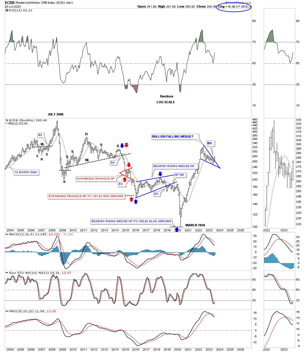
The weekly chart above shows the blue falling wedge which could be a stand alone consolidation pattern. On this particular monthly chart I’ve labeled the end of the first impulse move forming a bigger sideways trading range. At a minimum we could be seeing the bottom of the possible bigger consolidation pattern with one more rally up to the top and one more decline to form the all important 4th reversal point. At this point in time it is still too early to know if the smaller blue falling wedge is going to be “the” consolidation pattern that leads to the next impulse move higher or if we’ll see a slightly bigger consolidation pattern form.
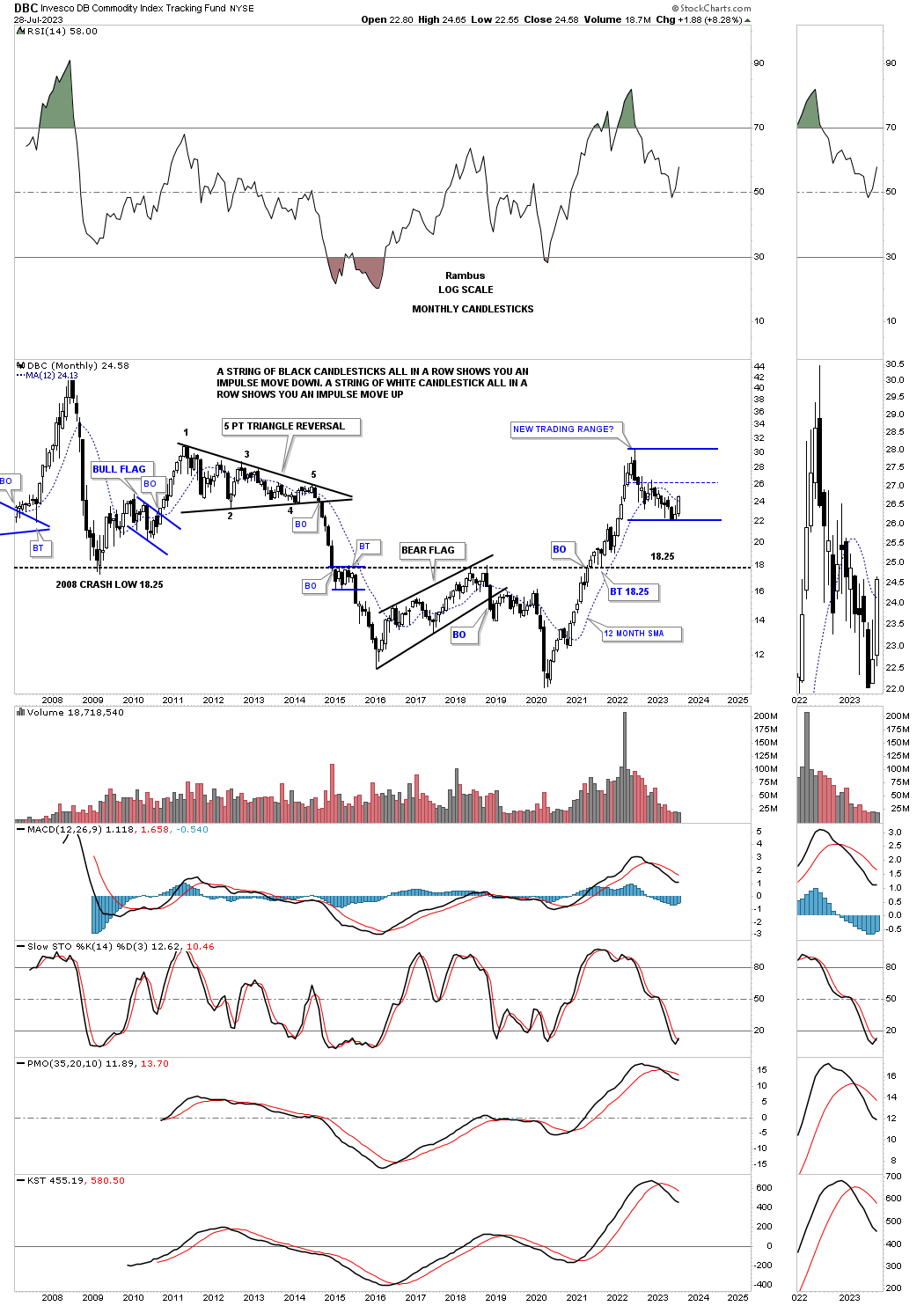
The DBC Commodity index, from the weekly perspective showing its own blue falling wedge.
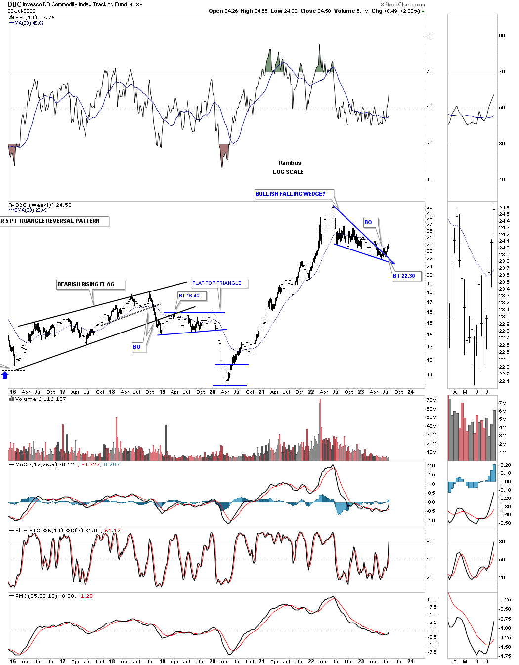
Again, similar to the CRB index we could be seeing a larger consolidation pattern under construction.
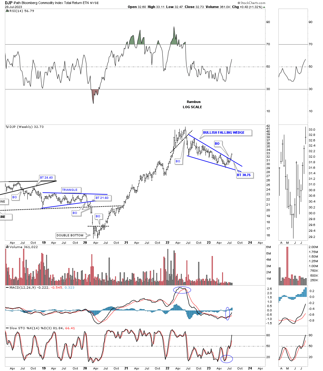
Next is the DJP, Bloomberg Commodity index, showing a similar 2022 falling wedge.
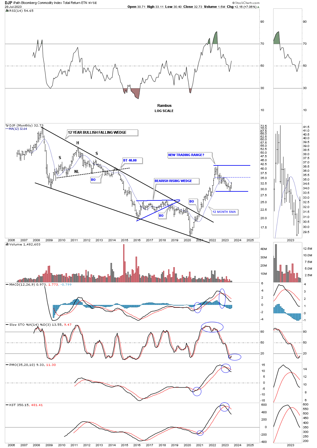
The rally out of the 2020 low broke out above the 12 year 6 point bullish falling wedge in no uncertain manner.
This long term monthly chart for the XLB, basic materials sector, shows the price action attempting to breakout from a nearly 2 year triangle consolidation pattern that has formed on top of the flat top expanding triangle. Note how well the secular bull markets looks out of the 2009 crash low with one consolidation pattern forming on top of the previous one. A triangle breakout now would bode well for the INDU as there are many basic material stocks in that index.

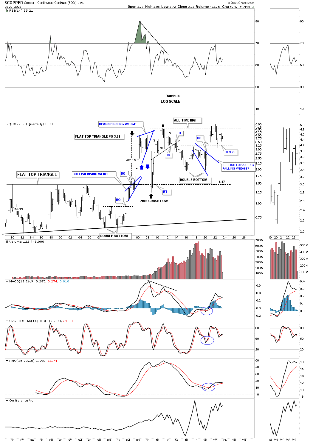
This shorter term weekly chart for Copper shows the double bottom that formed in 2022 with the blue expanding falling wedge forming on top of the double bottom trendline as the backtest currently.
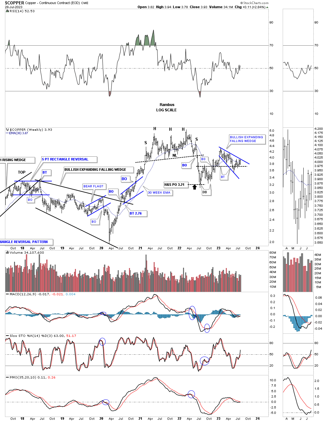
Copper is set up a bit differently from some of the commodity indexes we looked at above as it reached its all time high made back in 2008 after the 2020 low. It is now trapped between its old highs and the double bottom trendline. Note how close the price objective for that massive black flat top triangle was before the large decline into the 2008 low which held the backtest from above.
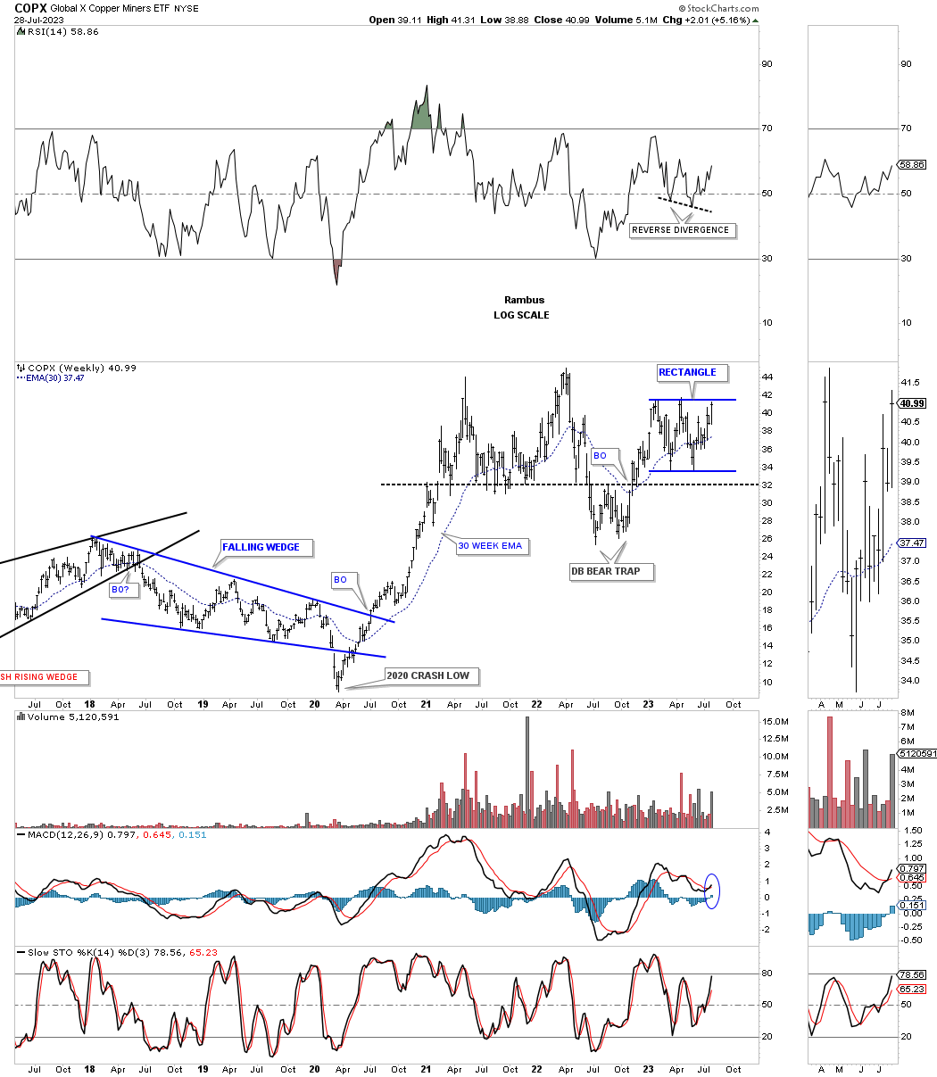
The COPX, Copper miners etf, is completing the all important 4th reversal point in the nearly one year rectangle with the double bottom trendline holding support.
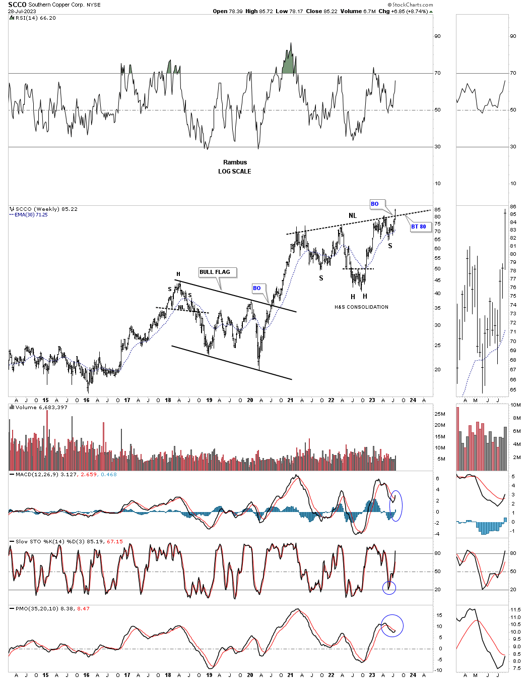
SCCO has always been one of the best Copper plays which is attempting to breakout from the H&S consolidation pattern forming on top of the previous bull flag.
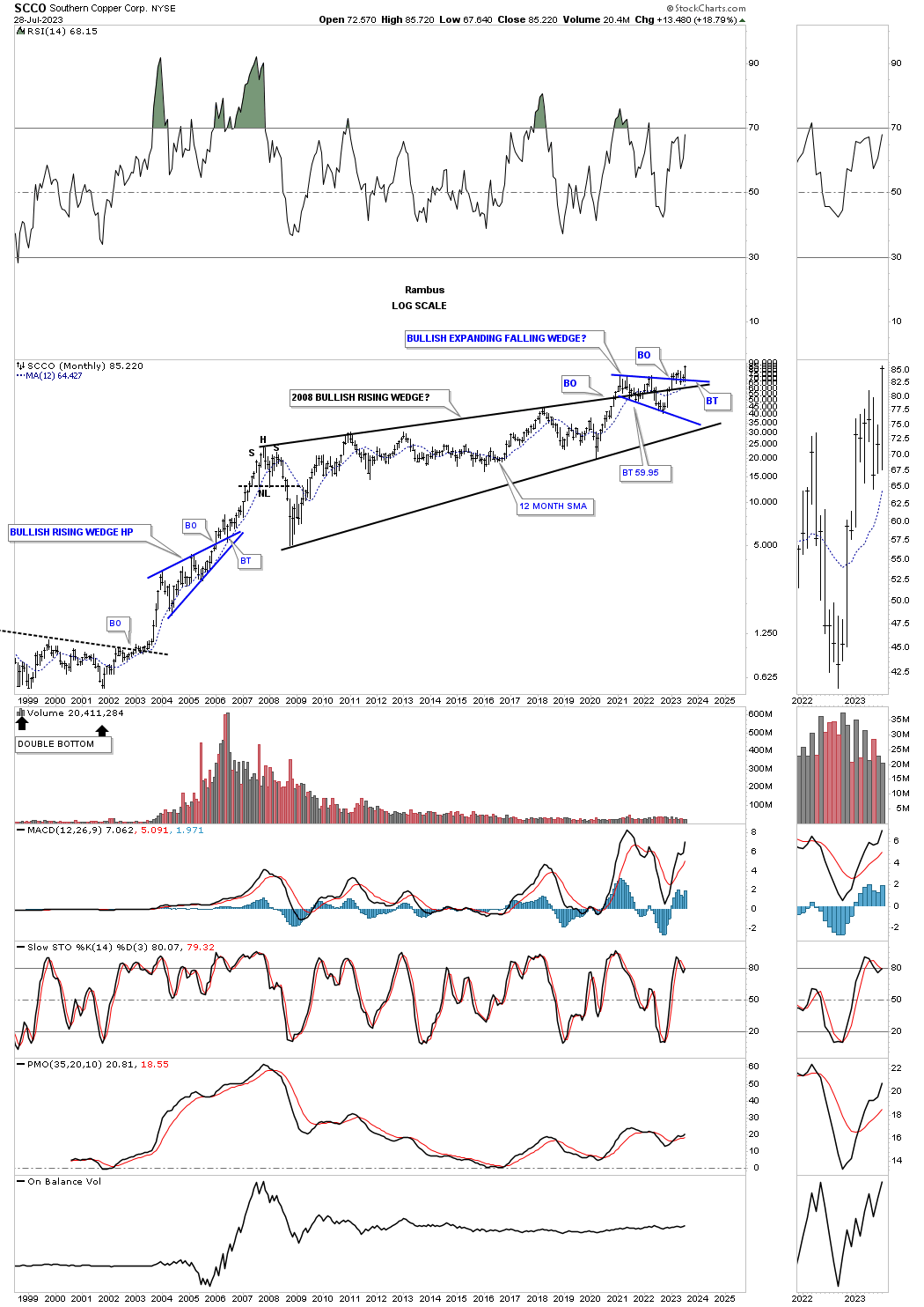
This much longer term monthly chart for SCCO shows the price action breaking out from the massive 2008 bullish rising wedge with the blue expanding falling wedge forming the backtest. It is now trading at a new all time high.
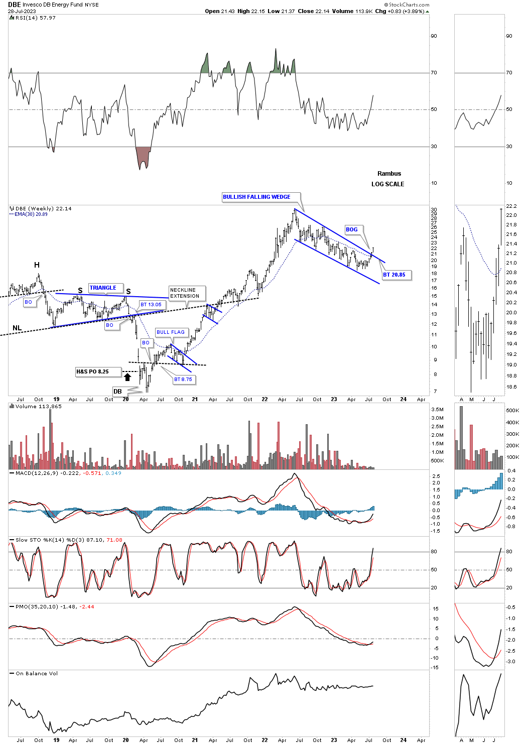
The DBE is an energy fund, which is attempting to breakout from its 2022 bullish falling wedge which looks a lot like the commodity indexes above.
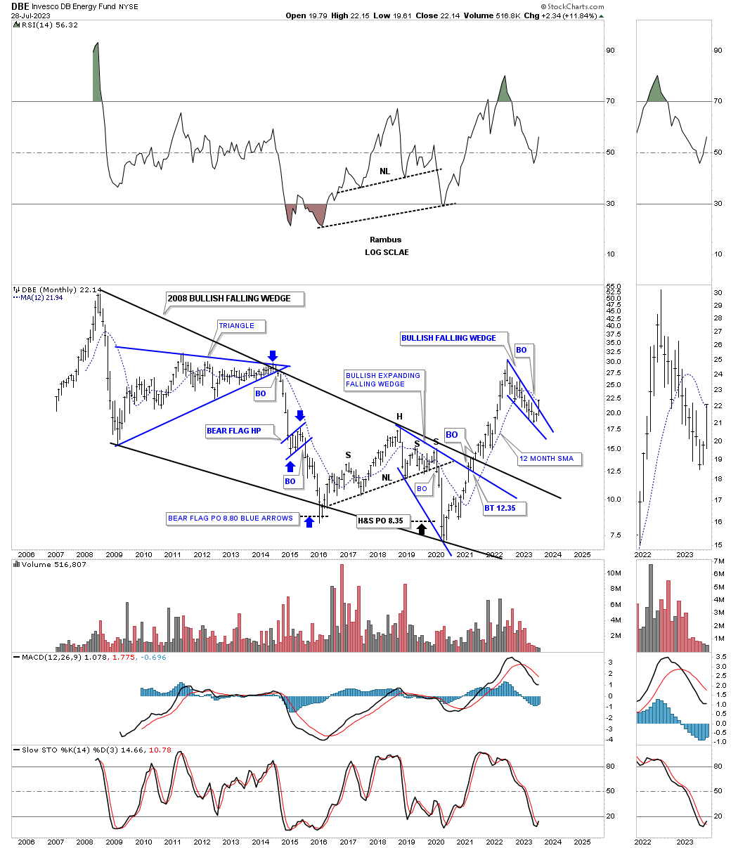
This long term monthly chart going all the way back to the 2008 all time high shows the rally out of the 2020 crash low breaking out from the 2008 bullish falling wedge in one strong impulse move.
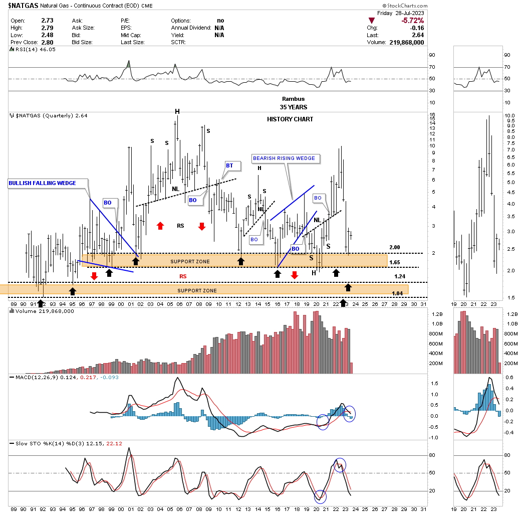
Natural Gas isn’t for the faint of heart as it can be extremely volatile. Earlier this year you can see the price action finding support where it has previously done three times since the 2012 low. It could also be forming a H&S bottom on top of the black dashed support line around the 1.84 area.
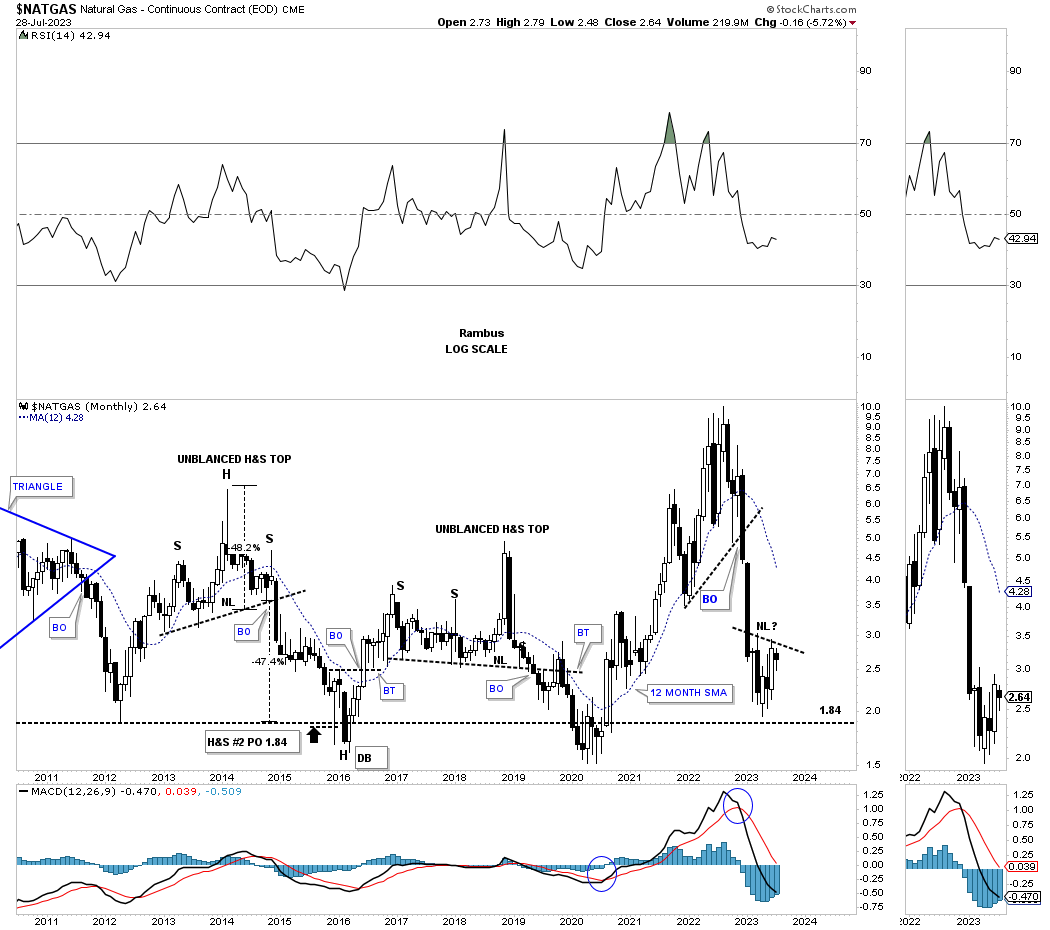
Below is the quarterly history chart for Natural Gas showing the brown shaded support zones.
The WTIC likes to form large trading ranges and once they are completed it spends little time fooling around.
Once the price action rose above the brown shaded S&R zone the WTIC has been taking its time backtesting it from above forming a fairly large bullish expanding falling wedge.
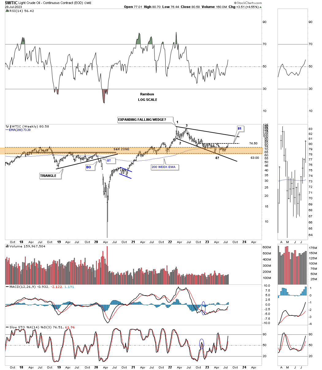
Note how the recent low formed on top of the blue rectangle for the second time as a backtest.
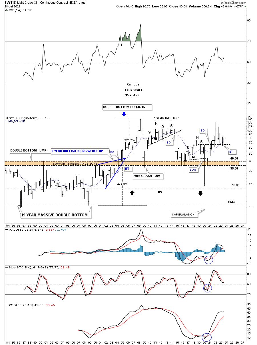
The old quarterly history chart for the WTIC shows the very large trading ranges from consolidation patterns to reversal patterns. Note the massive double bottom price objective which ended up showing the all time high back in 2008 at the 147 area.
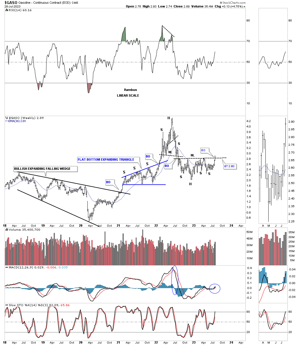
GASO, gasoline, is attempting to breakout from the nearly one year H&S bottom.
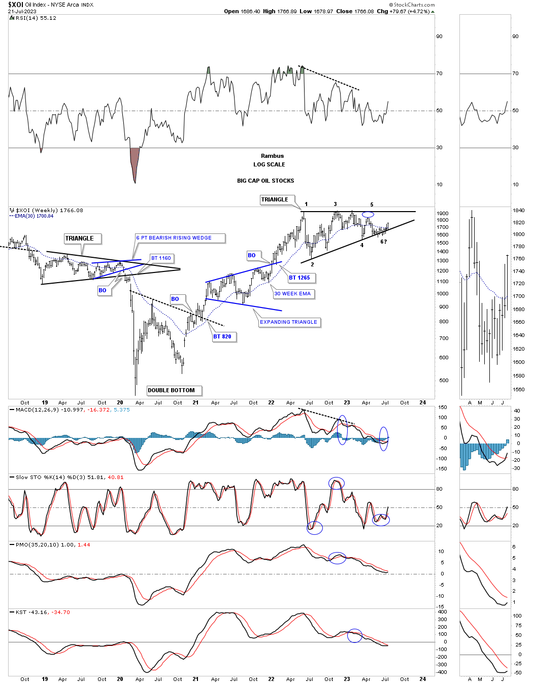
This weekly chart for the XOI, big cap oil stocks index, has found support on the bottom rail of its 2022 triangle.
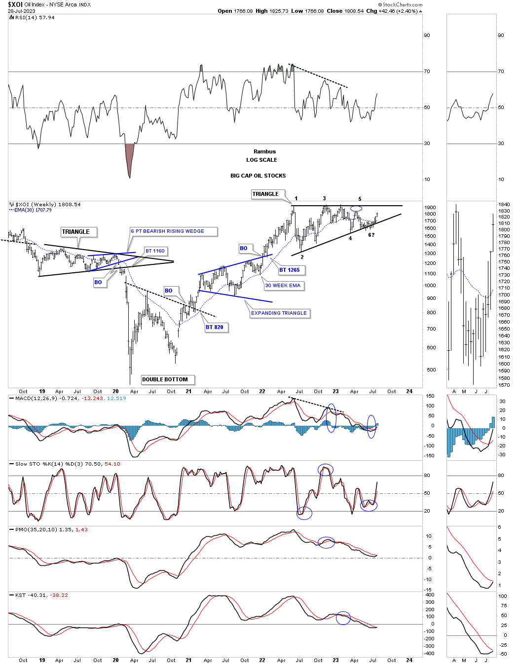
On a quarterly closing basis the XOI is very close to closing at a new all time high with 2 more months to go before the end of the 3rd quarter.
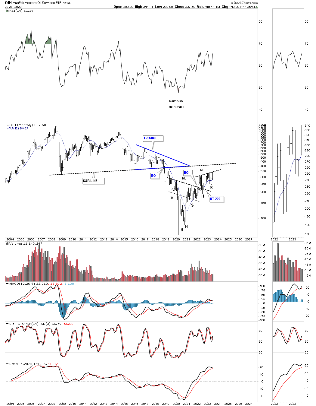
The OIH, oil services etf, created a large H&S bottom after the rally out of its 2020 low which formed the head. There have been several backtests to the neckline which have held support with the possible bullish rising wedge forming on top of the neckline.
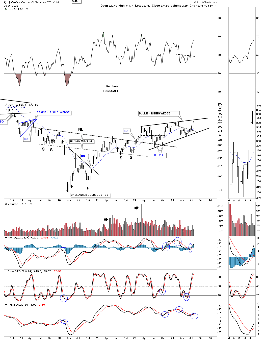
A slightly different look using the long term monthly chart.
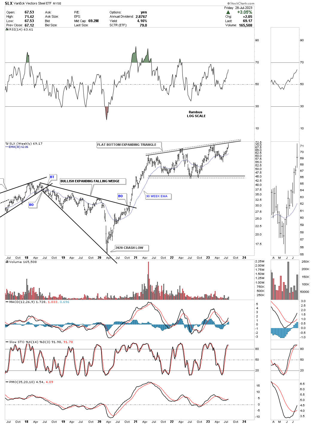
SLX, steel etf, has been forming a large flat bottom expanding triangle as its first consolidation pattern after its strong impulse move out of the the 2020 low. This weekly chart shows a good example of the 2018 bullish expanding falling wedge which are generally one of the most bullish chart patterns there is. When going through these commodity charts you will see many bullish expanding falling wedges which have led to some powerful impulse moves..
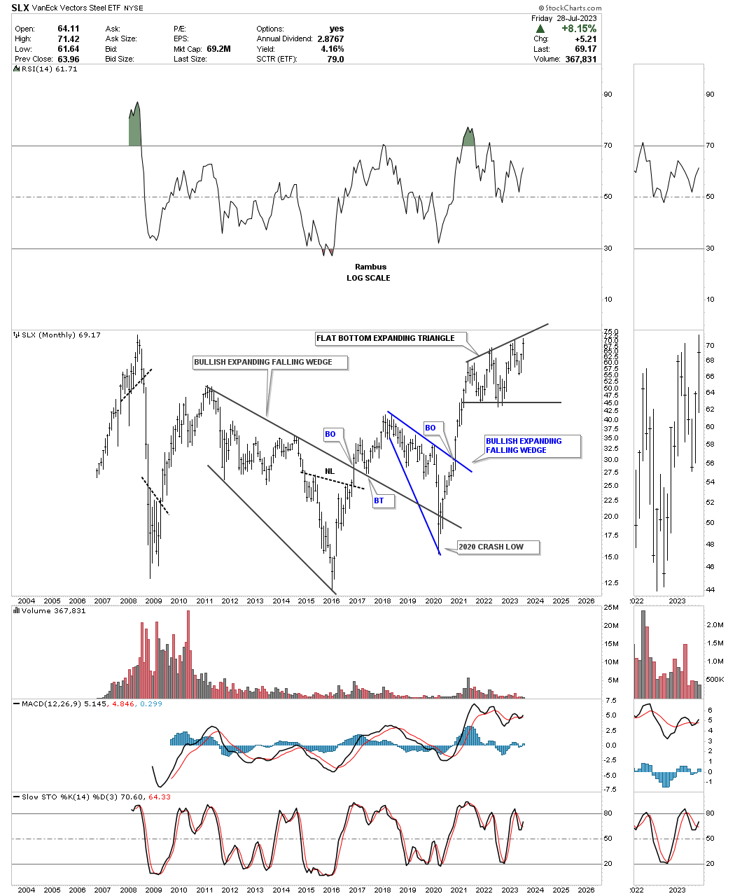
The SLX history chart.
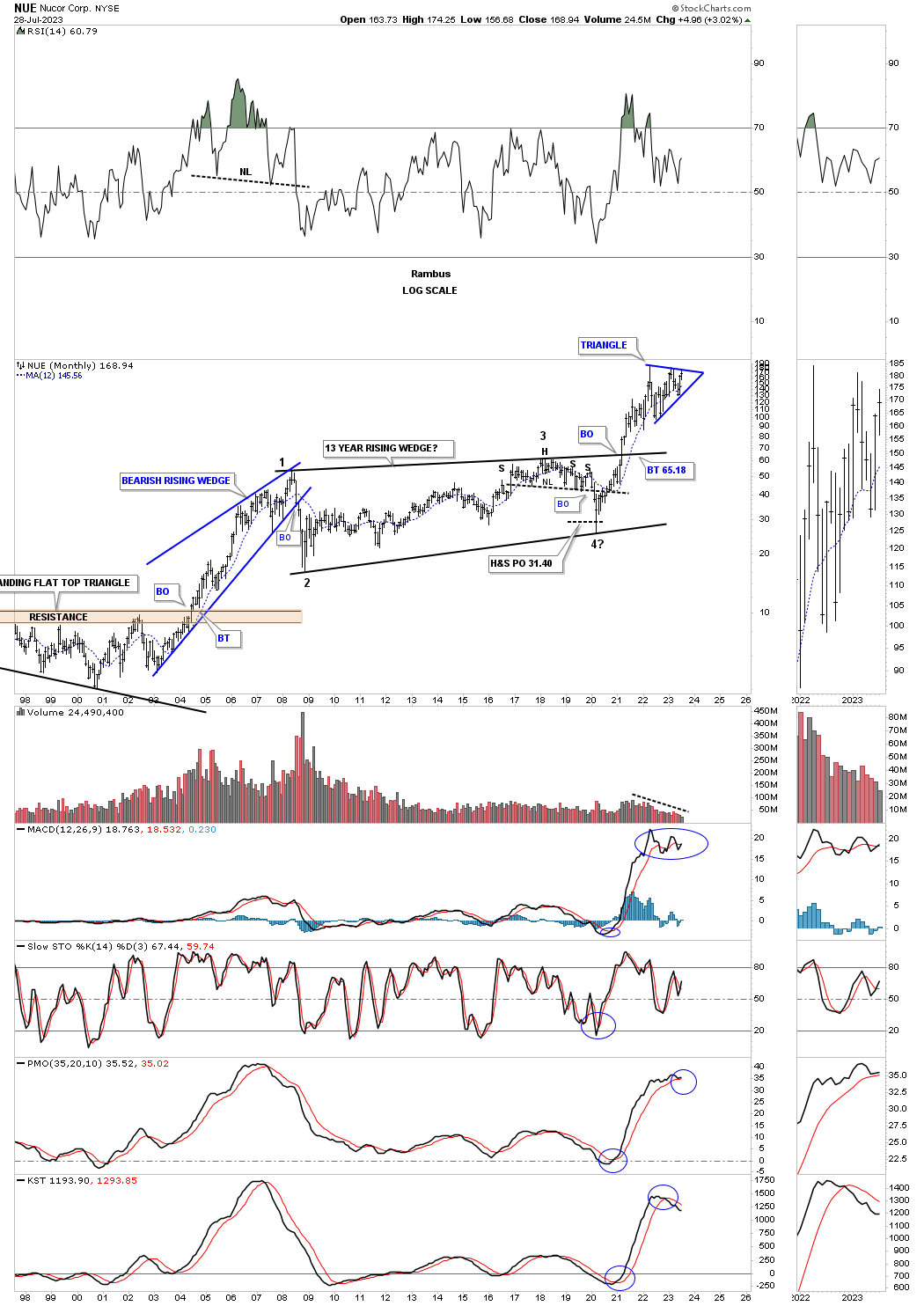
NUE, Nucor steel stock, is close to completing its 2022 triangle consolidation pattern after breaking out from its 2008 bullish rising wedge.
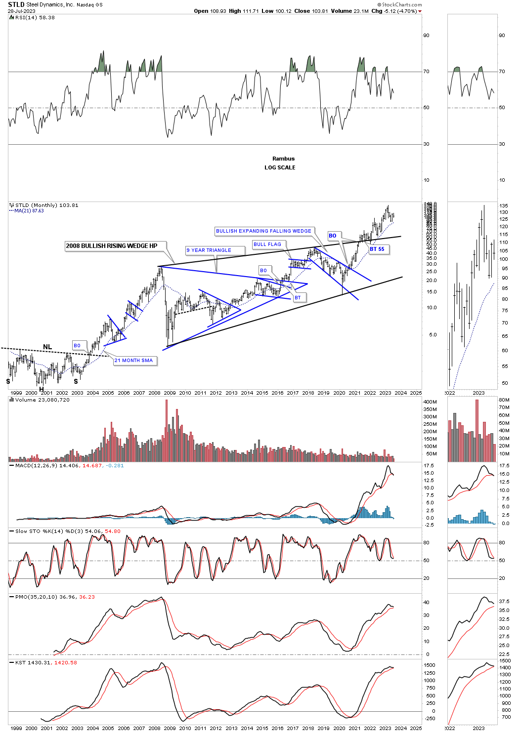
STLD, Steel Dynamics, also broke out from a very large 2008 bullish rising wedge and has been in backtest mode for the last couple of years.
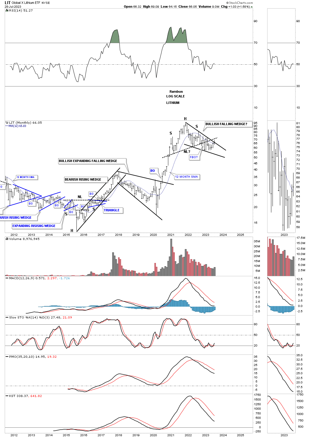
This weekly chart for LIT, Lithium etf, shows a possible bullish falling wedge under construction.
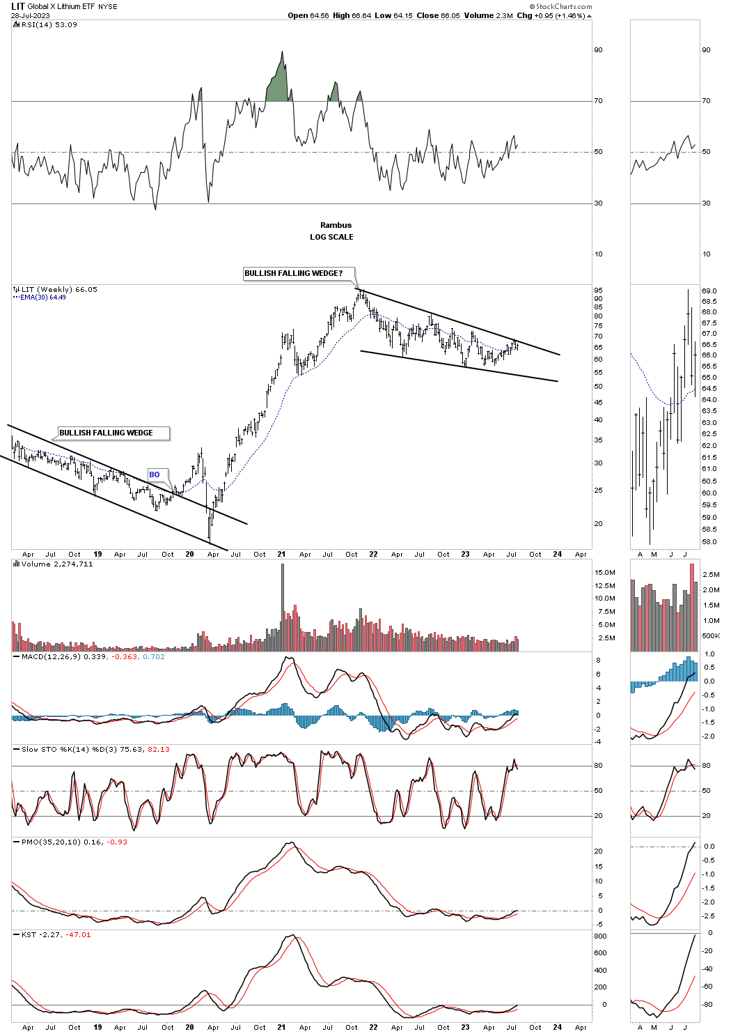
From the longer term perspective it still looks like a mixed bag. After its 2020 rally ended I had drawn in a possible H&S top. If the price action can trade back above the neckline that would open up the door for the possible bullish falling wedge.
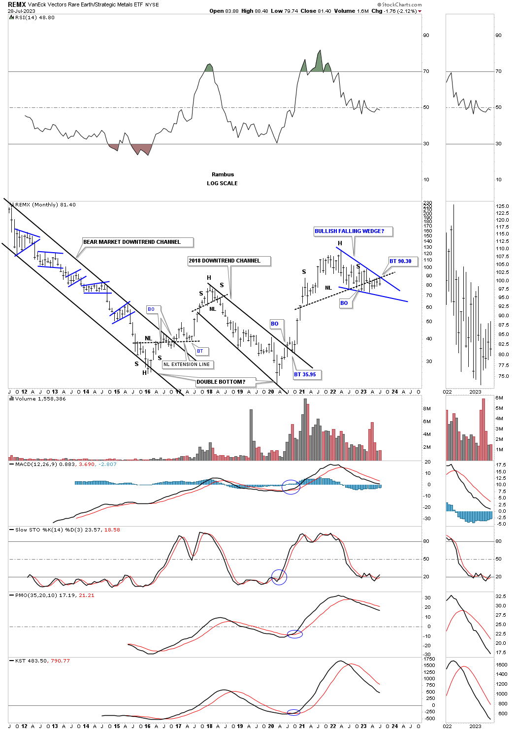
This history chart for REMX, rare earth etf, shows a similar setup to the LIT chart above.
This weekly chart for the URA, Uranium Fund, shows its sideways trading range since it 2020 rally.
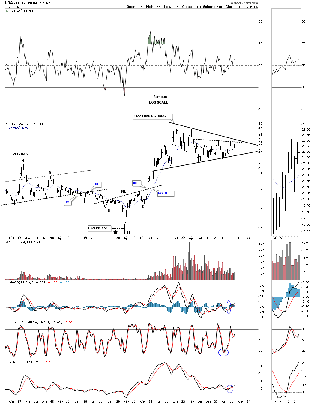
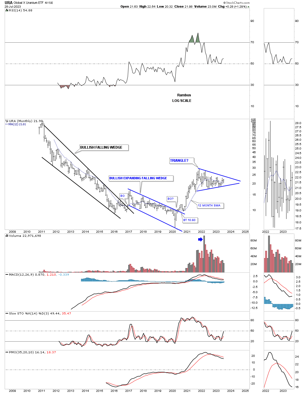
The history chart for URA.
This next area we’ll look at is the XME, metals and mining etf, which is going to play a big role in the mining of all the different metals. Similar to the XLB we looked at earlier it too is forming a blue triangle above its very large H&S bottom neckline.

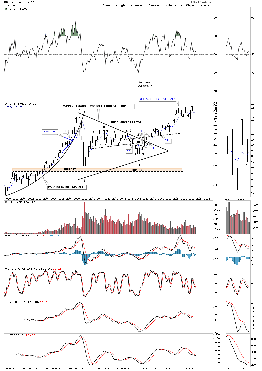
RIO, one of the biggest miners is the world, has been forming the blue rectangle consolidation pattern at its all time highs with the last reversal point coming in at the center dashed midline of its blue rectangle which can often times be the last reversal point before the next impulse move takes hold.
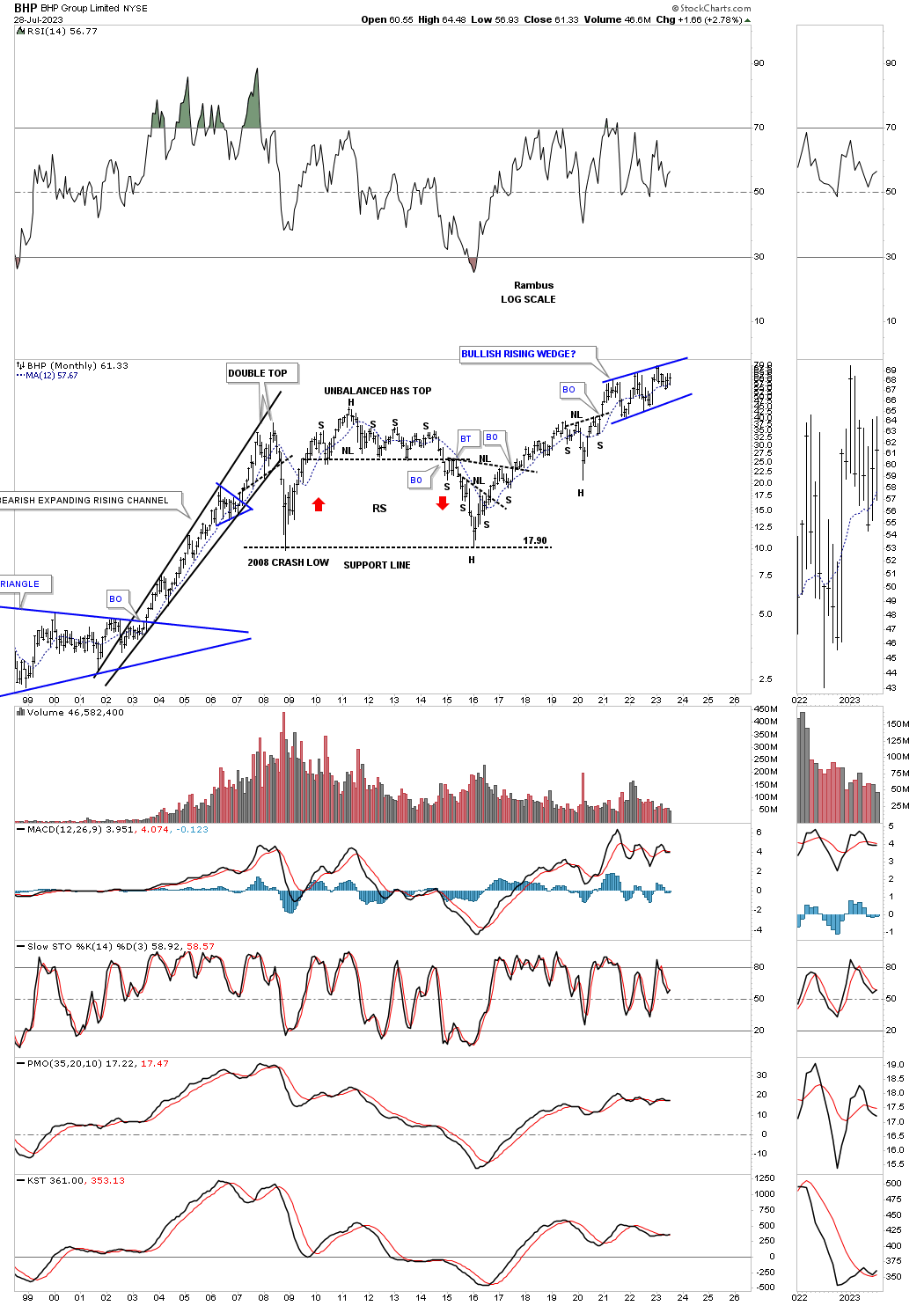
This last chart for tonight is the long term monthly chart for the BHP which is another one of the biggest mining companies in the world and has been building out the possible blue bullish rising wedge consolidation pattern in new all time high territory.
The charts above should give us a good feel for the inflation / deflation debate. Keep in mind these are long term charts which change slowly over time, but the big picture is there with a roadmap to show us the way forward. All the best…Rambus
PM Complex Update
Tonight I would like to update some old chart and posts I did back in 2016 and 2018 to show what we were thinking back then and how it relates to the present. The main takeaway is how frustrating it can be at times trading the PM complex, but how rewarding it can be if you don’t lose sight of the Chartology.
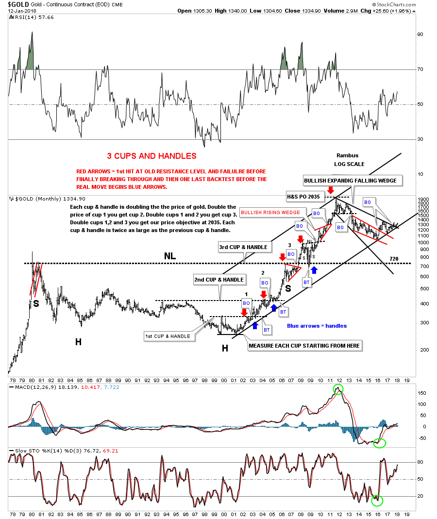
This is what I wrote on January 15th 2018:
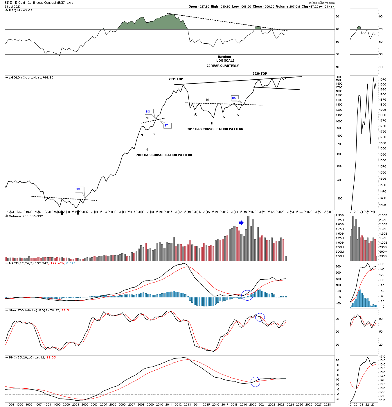
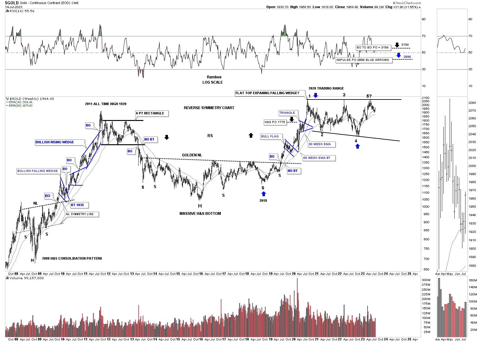
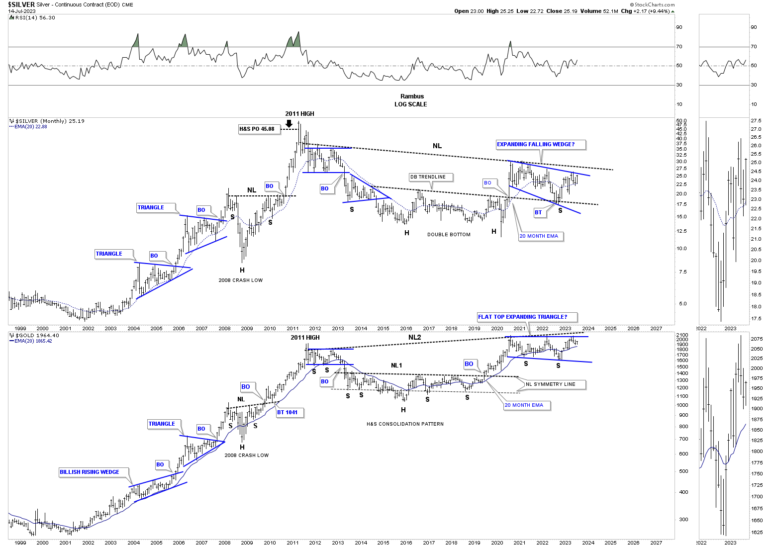
This last chart for gold has one of the biggest reversal patterns I’ve ever seen and one of the prettiest uptrends I’ve ever had the pleasure of charting. After the bull market top in 1980 gold fell into a bear market that lasted 27 years until the neckline was broken in 2007. For those that remember the 2008 crash gold found support on a backtest from above to that 27 year neckline, which gave me a big clue the correction was over. That massive H&S base had a price objective up to the 2035 area which was slightly higher than the 1920 actual high, but for big patterns like this it was pretty close.
The other beautiful Chartology on this chart is the 3 cups and handle patterns that formed gold’s bull market uptrend. There were three cups that doubled the price of gold to the next cup. The red arrows shows the initial hit of the resistance line followed by a small reaction or backtest. Then gold would rally through the resistance line and backtest it from the topside, blue arrows. The third cup was actually that massive H&S bottom.
Buying the absolute bottom isn’t always a good thing unless you have a lot of time for the trade to take hold. Gold actually bottomed two years ago, but has been doing a lot of the necessary work to launch the next leg up. While gold has been slowly working its way higher the real action has been in the stock markets which most gold investors want no part of, which is a shame. Your trading account doesn’t care where the money comes in from, only that it grows so you can enjoy the fruits of your labor.
I still have plenty of more big chart patterns to show you so I guess I will do a part 4 in the near future. Have a great Weekend. All the best…Rambus
Today July 16, 2023:
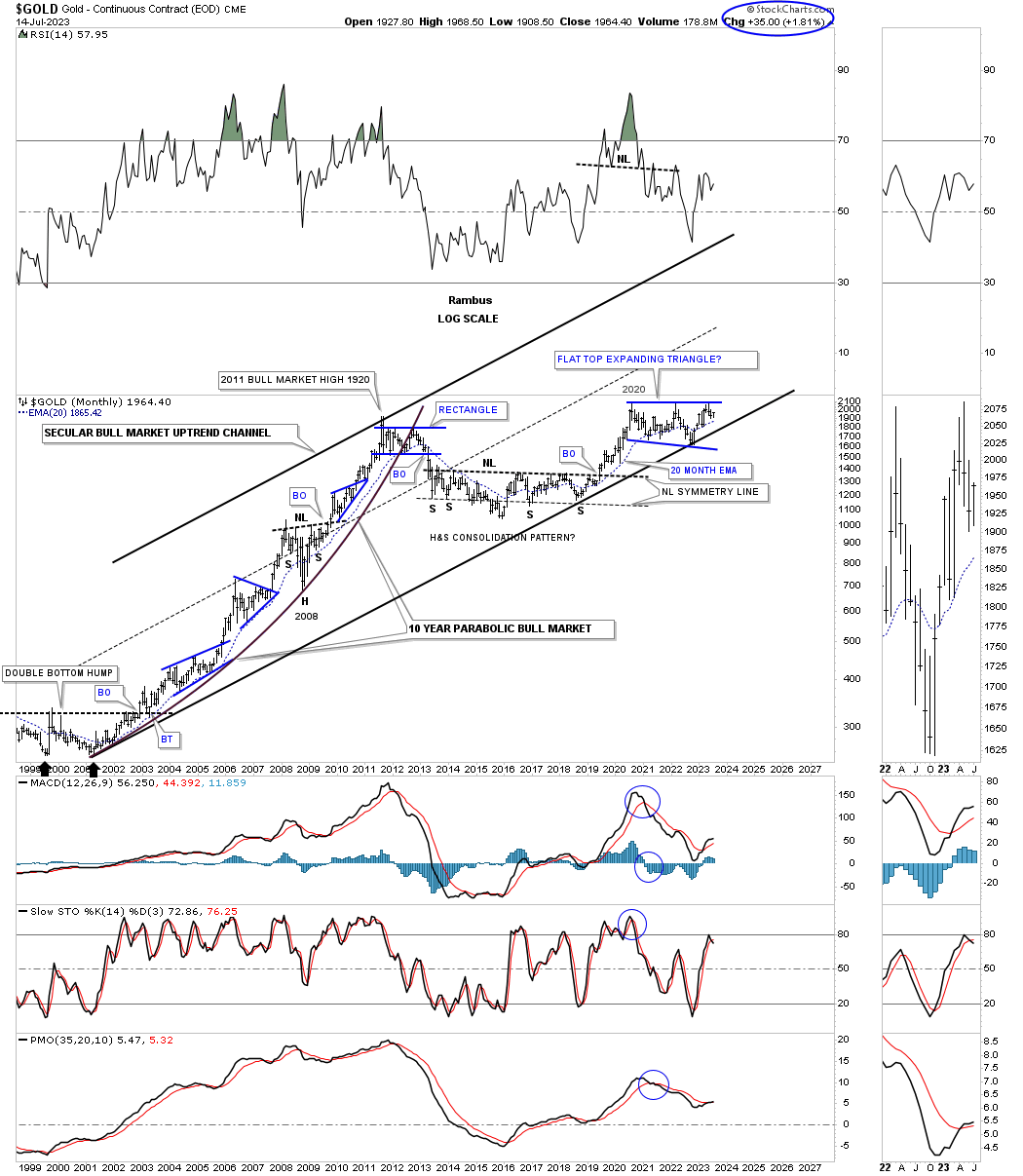
Below is the current chart for Gold’s Cup and Handle. As you can see the 2000 secular bull market uptrend channel is still in place but with the 2016 H&S consolidation pattern forming instead of the bullish expanding falling wedge as the chart above shows with the bottom of the red 7 point falling wedge reversal pattern being the head of the 2016 H&S consolidation pattern.
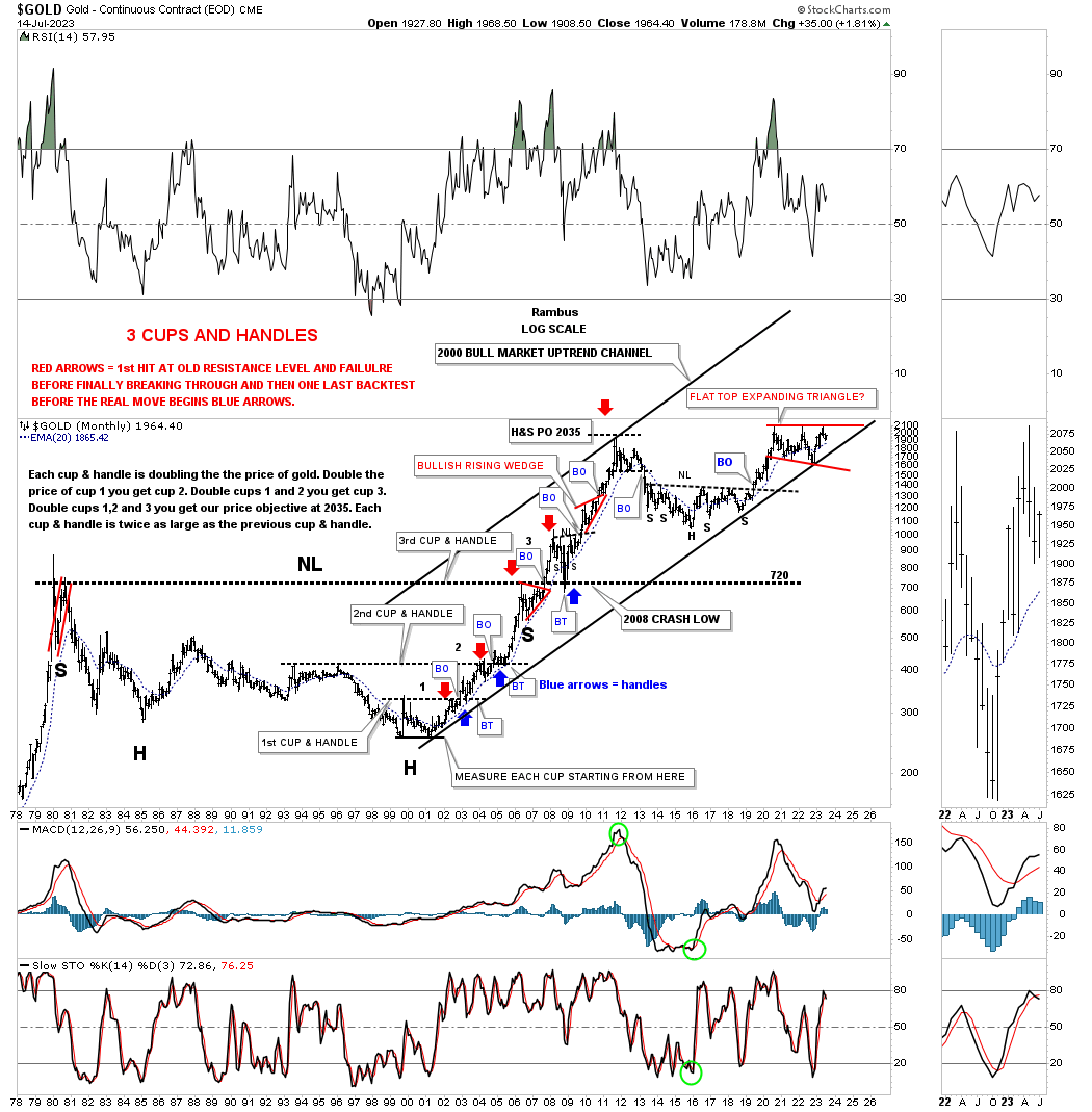
When looking at the massive cup and handle chart above, note what looks small from the very long term perspective, is the H&S consolidation pattern that formed the backtest to the 20 year H&S neckline at 720. It doesn’t look like much for that long term chart, but it was one of the most symmetrical H&S patterns that I’ve ever built.
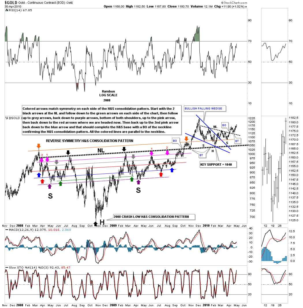
Below is the 2008 H&S consolidation pattern that formed the backtest to the 20 year neckline at 720. It wasn’t until the right shoulder started to form that I was able to start following the reverse symmetry taken from the left shoulder lows as the matching corresponding arrows show.
It looked all systems go when the neckline was finally overcome and the backtest was complete. There was the initial rally to new all time highs back then, but again as is often the case for Gold, it had one more trick up its sleeve. After the initial rally out of the 2008 H&S consolidation pattern Gold began to decline and formed the 2nd backtest to the neckline forming the blue bullish falling wedge. Upon the completion of the blue falling wedge Gold formed the classic H&S pattern with the left shoulder and head forming inside of the falling wedge with the right shoulder low forming close to the backtest point.
Just so you know how frustrating the price action can be it took right at one year to complete the breaking out and backtesting process. If you were still following the Chartology of what was taking place with the beautiful symmetry this whole chart shows you that you would have been well rewarded for your efforts as the 2nd backtest to the neckline led to the all time high of 1920 in August of 2011.
Next I would like to focus on Gold’s massive 2016 H&S consolidation pattern which led to the rally into the 2020 all time high.
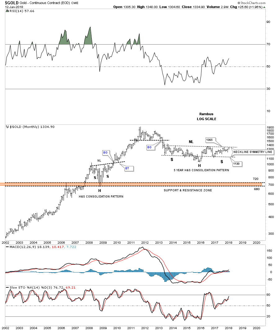
This is what I wrote on January 20, 2018 following the formation of the 2016 H&S consolidation pattern.
This next chart for gold shows the other reversal pattern that everyone is looking at which is the possible five year H&S consolidation pattern. Somewhere around the 1365 area the neckline will come into play, that’s when we will need to watch the price action very carefully. A breakout above the neckline will give us another level of confirmation that the bull market is back.
Today July 17, 2023:
When you compare the completed 2018 H&S consolidation pattern below you can see Gold still had one more trick up its sleeve which was the formation of the 2nd right shoulder before that massive H&S consolidation pattern was completed.
Note the 2008 H&S consolidation pattern we looked at in more detail on the 2nd chart above this one.
Below are just some updated charts we’ve been following fairly recently.
Gold’s 2000 secular bull market uptrend channel.
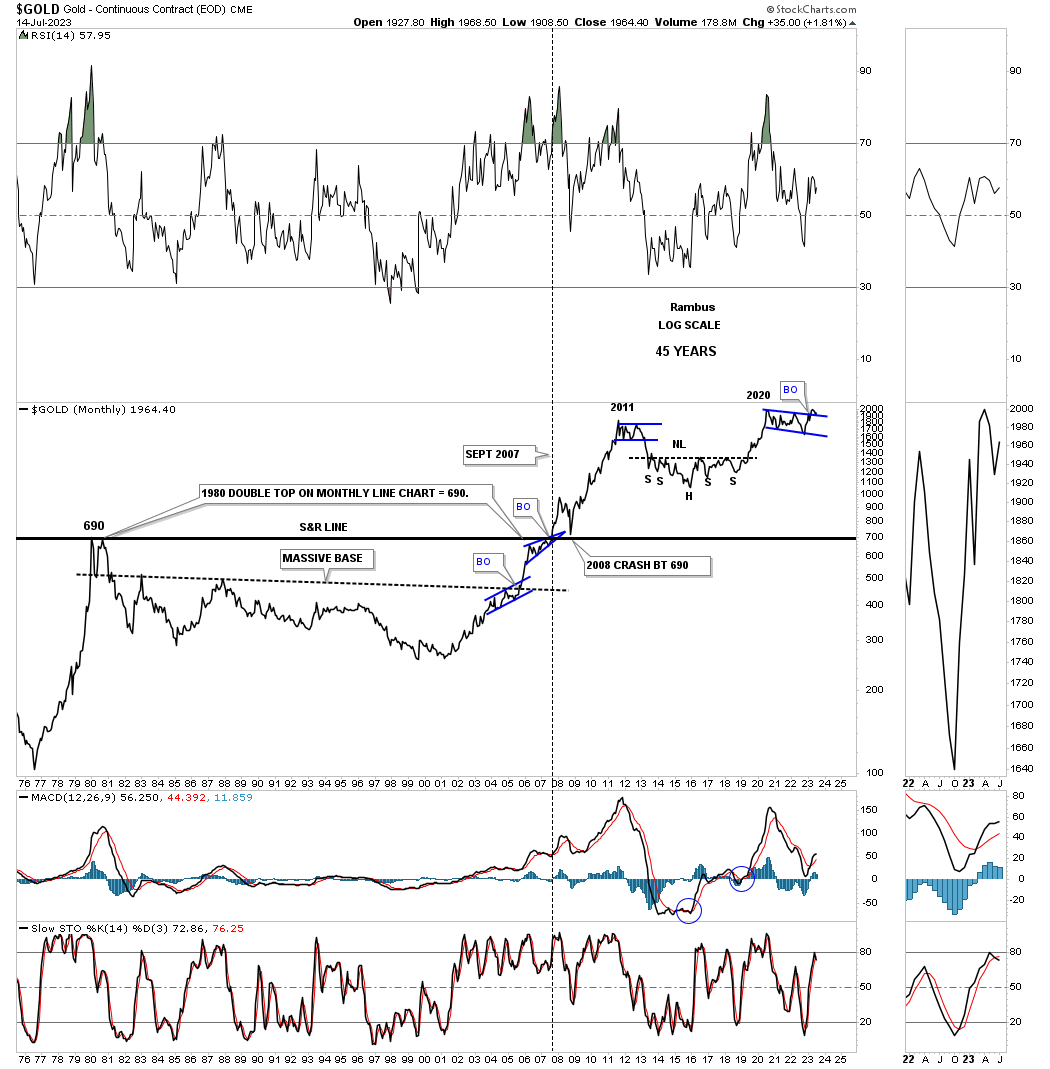
Gold’s 45 year massive 20 year base which shows the breakout of the S&R line with the backtest from above being that 2008 H&S consolidation pattern.
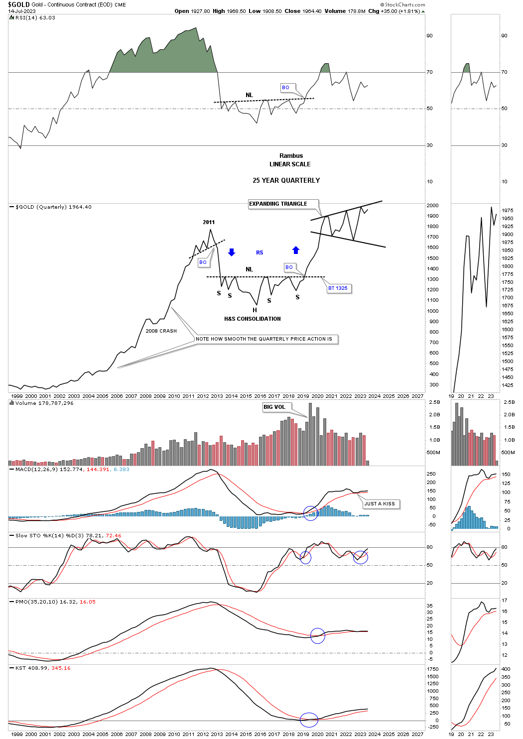
This quarterly line chart for Gold shows the first quarter of 2023 when Gold hit the top rail of its 2020 expanding triangle. The 2nd quarter of 2023 shows the price action declined just a bit telling us the top rail is still hot and to be respected. This 3rd quarter of 2023 shows Gold starting to rise once again. What will this chart look like at the end of the 3rd quarter of 2023?
As you can see from this quarterly line chart perspective once a strong move takes hold there is very little countertrend movement. Also note the reverse symmetry from the bear market decline in 2011 to the rally out of the 2016 H&S consolidation pattern. I suspect that if we finally see the breakout from the 2020 trading range that the next impulse move up will look very similar to the previous bull market rallies with little countertrend action from the quarterly line chart perspective.
Below is the long term combo chart which has Silver on top with Gold on the bottom. You can see the 2020 trading range that is still under construction with the possible massive H&S neckline still in play.
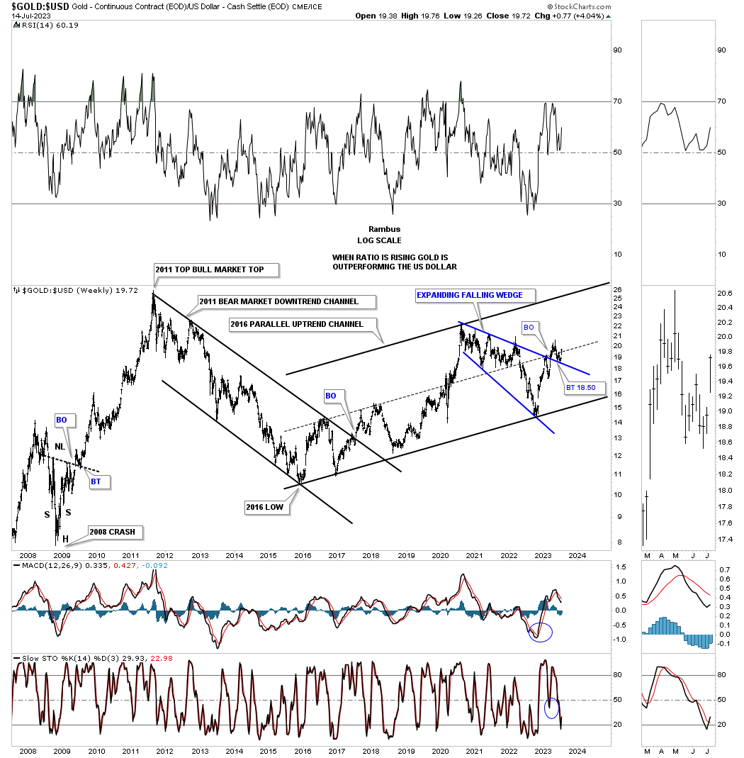
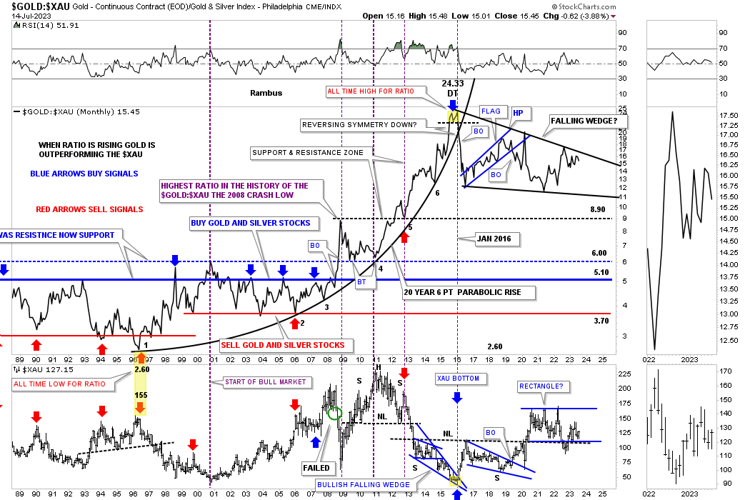
This next combo chart is probably one of the more important charts to keep a close eye on which is the Gold:US dollar ratio chart. You can see the bear market downtrend channel that began at the 2011 all time high for this ratio which led to the 2016 bear market low. Since the 2016 bear market low the ratio has been moving higher in a parallel uptrend channel which shows the blue expanding falling wedge that formed a double bottom backtest, see thumbnail on the right sidebar.
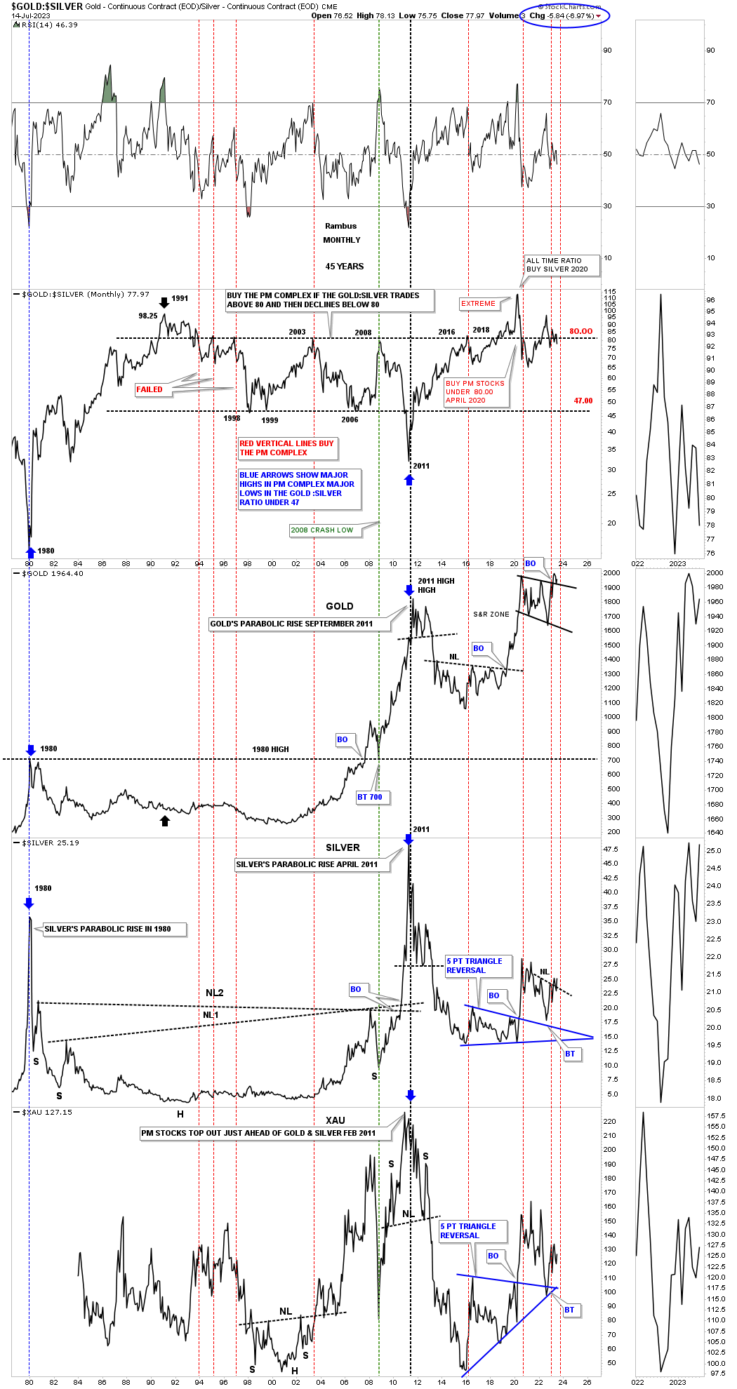
I’m running out of time but this ratio combo chart shows the Gold:Sivler ratio which can show bullishness for the PM stocks when it trades back below the 80 line. You can see Gold, Silver and the XAU below with both Gold and Silver in backtest mode while the XAU at the very bottom, and from this perspective may have already completed its backtest. The longer the ratio stays below 80 the better for the PM complex.
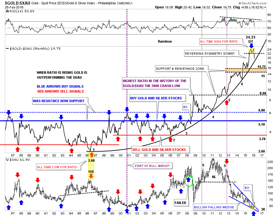
This next ratio combo chart is one we were following very closely back in 2015 and 2016 when the Gold:XAU ratio was putting in the small double top reversal pattern that was showing the possible end of Gold’s dominance over the XAU for over 20 years.
February 27, 2016:
Gold:XAU Ratio Chart…Finally a Turn .
I’ve been highlighting this ratio chart for some time now which is showing, perhaps one of the biggest clues, that at a minimum the $XAU is now going to outperform gold. I’ve added a few more lines to help you understand the importance of this chart for the big picture because the big picture dominates all other time frames unless you’re a short term trader. To get in at the bottom of a bear market doesn’t happen very often in ones investment career but the potential is there right now in the PM complex.
The last time we looked at this ratio chart I pointed out the potential double top that was forming at the most recent highs. As you can see the double top is now more pronounced as the ratio starts declining. Note how the price action is reversing symmetry down over the same area on the way up. Is that double top at 24.33 the all time high for this ratio chart? Time will tell. The first real area of support would come in at the brown shaded support and resistance zone between 15 and 15.75.
Next I would like to show you why this ratio chart is so important for the big picture. I’ve added a parabolic arc to the six lows that began forming at the all time low at 2.60 in 1996 on the ratio chart. The yellow shaded area shows how close the ratio chart at 2.60 and the high for the $XAU at 155 was in 1996. For the last 20 years gold has been outperforming the $XAU with a few mild corrections along the way like the 10 year bull market that began in 2000. Even then the ratio just traded sideways until it broke out topside during the 2008 crash which set into motion a massive divergence where gold just kept outperforming the $XAU.
Now we can look to the right hand side of the chart where you can see the double top on the ratio chart at 24.33. Keep in mind the double top is a reversal pattern which is showing up after 20 years of gold outperforming the $XAU. Twenty years is pretty amazing when you think about it. Looking at the $XAU chart at the bottom you can see the blue bullish falling wedge that broke out this month.
So we have the ratio chart putting in a 20 year double top and the $XAU putting in an all time low at 38 or so. What these two charts are strongly suggesting to me is that it’s finally the big cap PM miners turn to outperform gold going forward. It’s right there before our very eyes. What will these two charts look like in a year or two years or five years? If we look back at this bottom in a year or two and it stands out like a sore thumb then you can say you bought the very bottom of the bear market. There is no bell that goes off at the bottom of a bear market. There will always be doubt every time there is a down day or when the inevitable corrections take place. I can tell you right now the hardest thing will be staying on the bull, it’s the nature of the beast to throw us off.
Chartology got us out or short during most of the bear market, and now Chartology will keep us in the bull market until something drastically changes these long term charts. I think we’re witnessing the end of a massive 20 year divergence between the $XAU and gold which is going to lead to much higher prices for the big cap PM miners over the ensuing bull market. Have a great weekend. All the best…Rambus
Today July 16th 2023:
This current ratio combo chart shows what has happened over the last 7 years or so. That little double top we looked at back at the 2016 all time high for the ratio did indeed reverse the 20 year parabolic rise Gold had over the XAU. Since the 2016 all time high the ratio has been building out a completed 4 point falling wedge. What would be the most bullish thing we could see for the PM stocks in general would be to see this ratio break below the bottom rail of the 2016 falling wedge which would create a 5 point bearish falling wedge reversal pattern to the downside. I always thought at some point in the future the ratio could get back down to the normal area it used to trade between the blue and red horizontal buy and sell lines.
On the bottom you can see the XAU bear market out of its 2011 all time retraced the 2000 bull market 100% before forming the 2016 bullish falling wedge.
HUI long term monthly history chart shows the price action trading below the top rail of the 2020 expanding falling wedge and the bottom rail of the 2000 secular bull market uptrend channel.
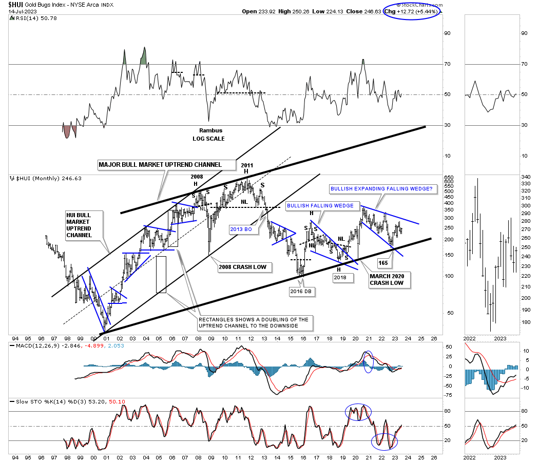
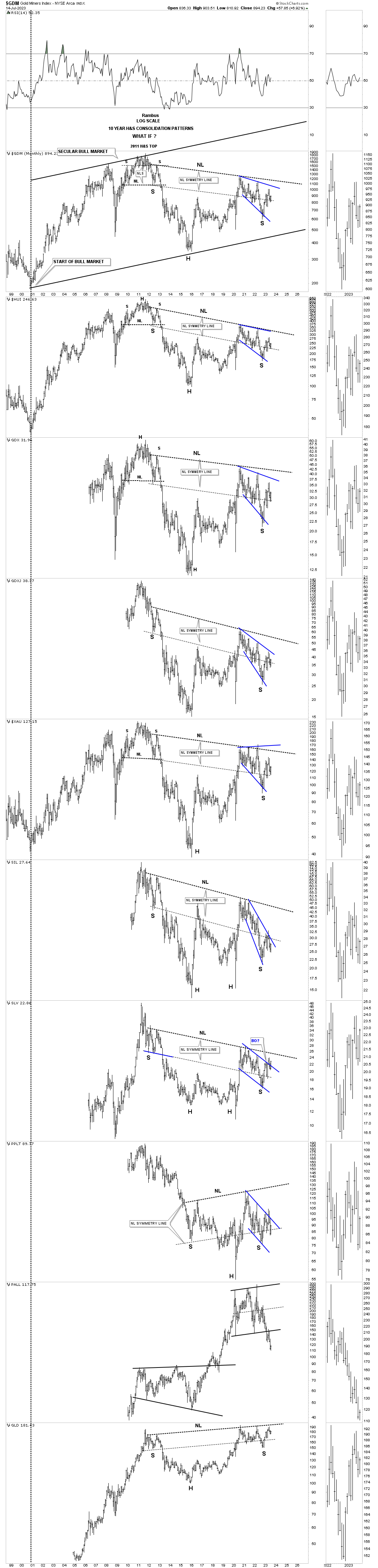
I’m going to finish up with this last long term monthly chart for the PM complex which I first built well over a year or so ago which is still relevant with PALL still looking by far the worst area in the PM complex.
I wanted to highlight, by the old post I did back in 2016 and 2018, that the PM complex can be a very frustrating game to play if one isn’t aware of the Chartology. The 2020 trading range which is going to be three years old in August is still in play, but when will the breakout take place, that’s the million dollar question. It definitely looks shorter rather than longer as three years is a big trading range by any standard.
Always remember the bigger the trading range the bigger the move. All the best…Rambus
Related Reading:
- Rambus: Blockbuster Chartology – May, 2023
- Rambus: Blockbuster Chartology – January, 2023
- Rambus: Blockbuster Chartology – October, 2022
- Rambus: Blockbuster Chartology – July, 2022
- Rambus: Blockbuster Chartology – May, 2022
- Rambus: Blockbuster Chartology – February, 2022
- Rambus: Blockbuster Chartology – October, 2021
- Rambus: Blockbuster Chartology – July, 2021
- Rambus: Blockbuster Chartology – April, 2021
- Rambus: Blockbuster Chartology – January, 2021
- Rambus: Blockbuster Chartology – October, 2020
- Rambus: Blockbuster Chartology – July, 2020
- Rambus: Blockbuster Chartology – May, 2020
- Rambus: Blockbuster Chartology – January, 2020
- Rambus: Blockbuster Chartology – October, 2019
- Rambus: Blockbuster Chartology – July, 2019
- Rambus: Blockbuster Chartology – April, 2019
- Rambus: Blockbuster Chartology – January, 2019
- Rambus: Blockbuster Chartology – October, 2018
- Rambus: Blockbuster Chartology – July, 2018
- Rambus: Blockbuster Chartology – April, 2018
- 2017 Annual Wrap Up – Does Your Pension Fund Have A Deep State Drain? – January, 2018
- 1st Quarter Wrap Up 2018 Web Presentation
- Blockbuster Chartology with Rambus – October, 2017
- Blockbuster Chartology with Rambus – July, 2017
- Blockbuster Chartology with Rambus – May, 2017
- Blockbuster Chartology with Rambus – January, 2017
- Blockbuster Chartology with Rambus – October 20, 2016
- Blockbuster Chartology with Rambus – July 21, 2016
- Blockbuster Chartology with Rambus – April 21, 2016
- Rambus: Are We in a Deflationary Spiral? – January 28, 2016
- The Dollar, Gold & the S&P 500 with Rambus – October 15, 2015